Aya Sushi
A mobile app that allows customers to place orders and pay ahead of time
Aya Sushi is a San Francisco Bay Area sushi restaurant chain that aims to deliver delicious, specialty sushi and other Japanese dishes. The target customers for their mobile application are people with busy schedules who lack the time or ability to eat at the restaurant in-person or prefer to eat at home.
Project Overview
My Role
UX designer designing an app for Aya Sushi from conception to delivery
My Responsibilities
Conducting interviews, paper and digital wireframing, low and high-fidelity prototyping, conducting usability studies, accounting for accessibility and iterating on designs
Timeline
February 2022 - September 2022
The Problem
People with demanding schedules lack the time and energy to cook meals at home.
The Goal
Design an app for Aya Sushi that allows users to easily order and pick up fresh, delicious sushi at their convenience.
Understanding the User
User Research
I conducted interviews and created empathy maps to understand the users I’m designing for and their needs. A primary user group identified through research was adults who don’t have time to cook meals and prefer to order takeout.
This initial round of research confirmed initial assumptions about Aya Sushi’s customers, but it also revealed that time was not the only factor limiting users from cooking meals at home. Other user problems included preferences to eat at home and family and personal obligations that make it difficult to cook at home or eat at restaurants.
User Pain Points
1. Time Constraint: Customers of all ages, from working adults to college students, do not have enough time to cook meals at home.
2. Price Visibility: Menus and ordering platforms often hide prices until the end of an ordering process.
3. Dietary Restrictions: Customers with dietary restrictions find it difficult to order from restaurants that do not offer customization.
4. Accessibility: Menus with lots of text and apps without simple navigation are difficult to navigate for people with visual impairments and other disabilities.

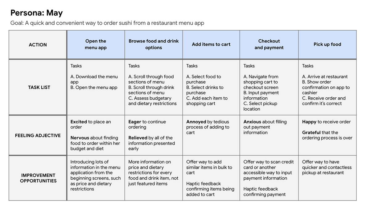
Persona: May
Problem Statement: May is a college student who needs to order food from menus with prices and ingredients clearly listed because she has a limited budget and dietary restrictions.
User Journey Map: May’s user journey map revealed that it would be extremely beneficial for Aya Sushi customers to have access to an app dedicated to placing orders and paying ahead of time.
Starting the Design
Paper Wireframes
Prior to creating digital wireframes, I took time to draft iterations of each screen of the user flow on paper to ensure that the digital wireframes would be well-suited to address user needs. I marked the elements I wanted to carry into my digital wireframes with a star.
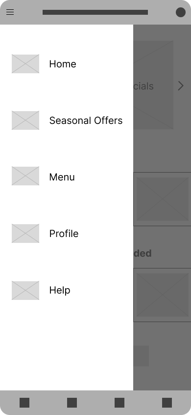
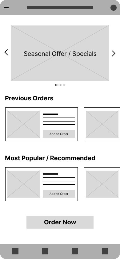
For the home page, my goal was to address the user pain points I discovered in my initial round of user research, two of which included time constraints and accessibility. In order to make the ordering process as quick as possible, I designed home page layouts that allowed users to order their favorite items from past orders with a single tap, as well as featured and recommended menu items. To ensure that my design could be navigated through with a screen reader and by people with disabilities, I planned to include a side menu, as well as a bottom navigation bar to easily access the most important screens of the user flow.
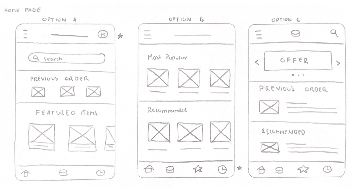
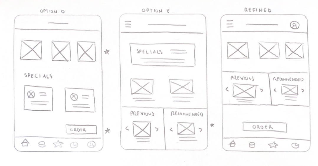
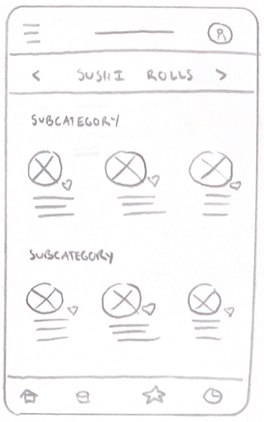
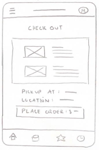
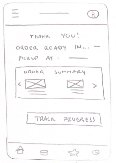
Below are the refined paper wireframes for the five main screens of the user flow.


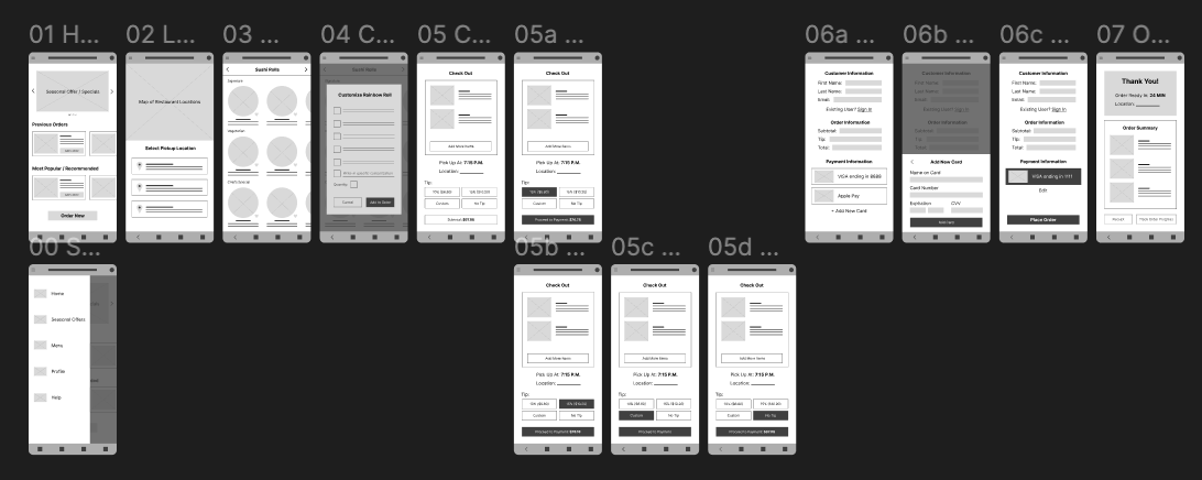
Digital Wireframes
As I constructed digital wireframes, I made sure to base my screen designs on feedback and findings from initial user research.
The "Previous Orders" section of the home page allows users to quickly order items they’ve purchased in the past. The side menu allows users to access important screens from anywhere within the app, such as the main menu and their profile with saved payment information, and also allows the app to work with assistive technologies.


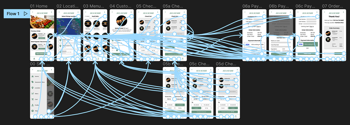
Low-Fidelity Prototype
I created a low-fidelity prototype to use in usability studies, which included the primary user flow of ordering sushi for pick up.
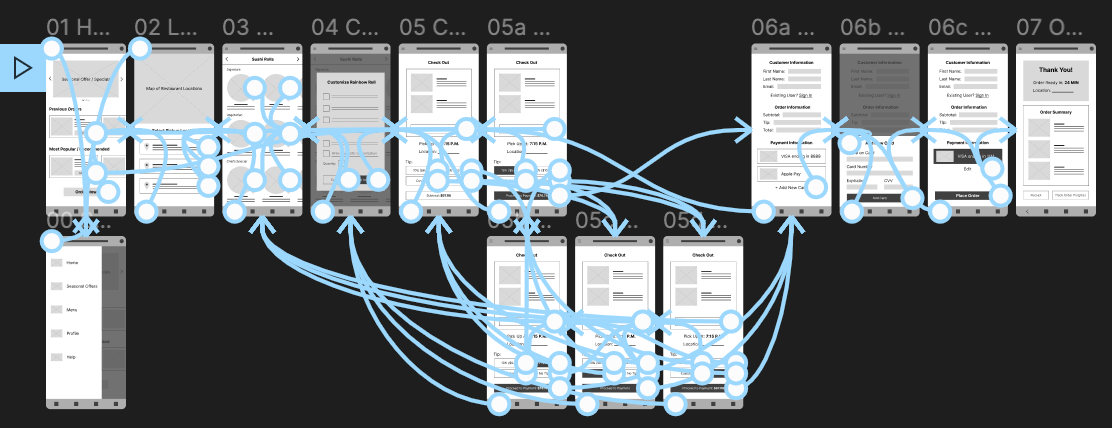
Usability Studies
I conducted two rounds of usability studies, which helped determine where my designs were successful in meeting user needs and where further iteration was required. The first usability study helped transform my initial digital wireframes to mockups, and my second usability study used my high-fidelity prototype and revealed where final refinements were necessary.
Round 1 Findings:
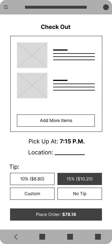
1. Users want to place orders quickly
2. Users want to customize their orders
3. Users want payment confirmation
Round 2 Findings:
1. Users need more flexibility and entry points into the main ordering flow
2. Users want to customize orders from their cart
For a more detailed explanation of my usability studies, feel free to view this research presentation.
Refining the Design
Mockups
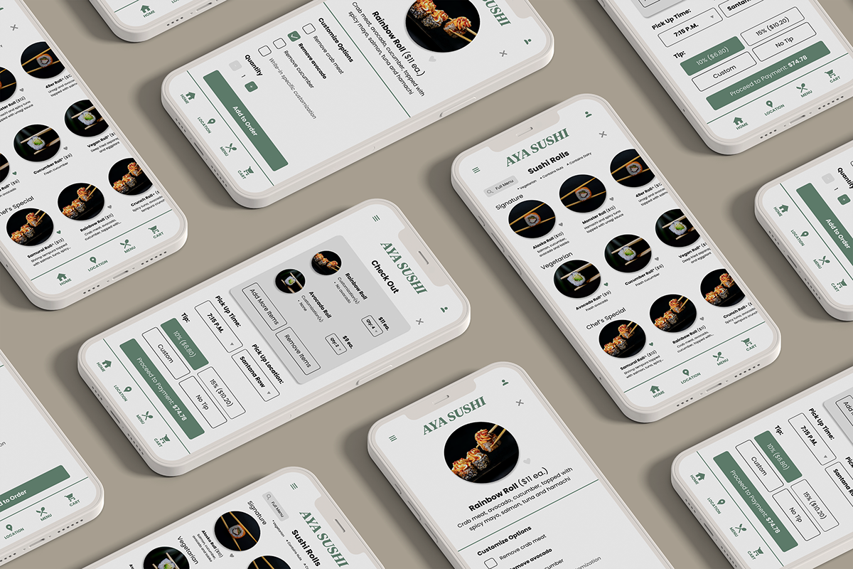
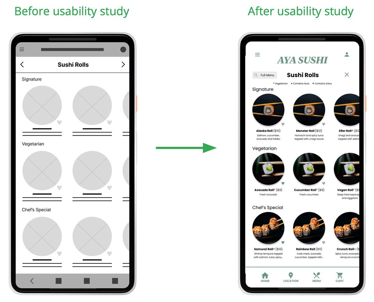
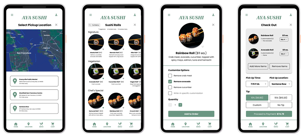
Early designs allowed for some customization, but after usability tests, I added a field for users to type out personalized customization requests and adjust the quantity within the same window. I also revised the design to be more visual and include item descriptions.

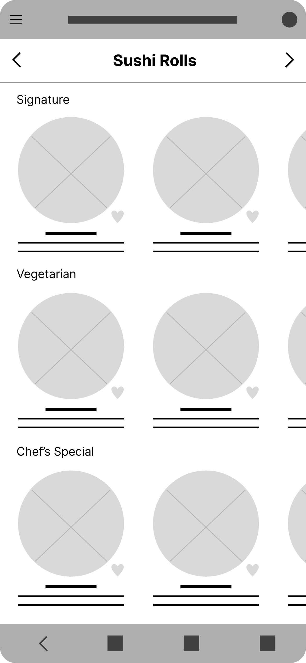
Early designs included large visuals and a menu organized by section. After usability tests, I added a search field for users to easily find what they want to order and a key for common dietary restrictions.
More Mockups
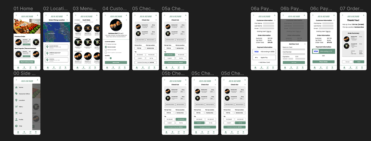
High-Fidelity Prototype
The final high-fidelity prototype presented cleaner, more intricate user flows complete with motion animations as users move through the process of placing an online order.
Accessibility Considerations
1. App color scheme adhered to WCAG standards. The primary green color throughout the app exceeds recommended accessible color contrast ratio of at least 4.5:1.
2. Provided access to users with visual impairments through adding alt text to images for screen readers and multiple avenues of navigation, including a side menu and a bottom navigation bar.
3. Used icons and large visuals to make navigation easier for people with dyslexia and visual impairments. Prototype animations added extra clarification that progress was being made toward completing intended tasks.
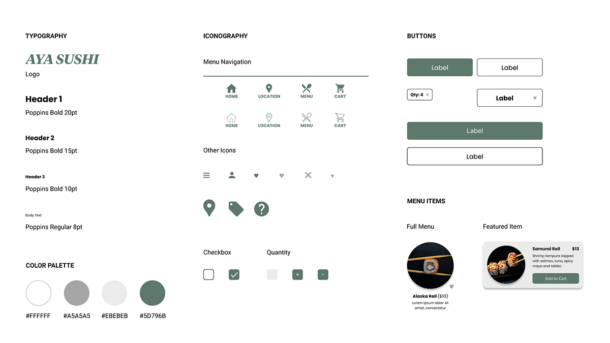
Visual Design
Using my knowledge of design systems and visual design, I created a style guide containing Figma components, typography standards and a color scheme to keep my designs consistent across all screens.
Takeaways and Next Steps
Impact
The newly designed app makes users feel like Aya Sushi carefully considers how to meet their needs and serve the highest quality sushi.
What I Learned
While going through the entire design process to create the Aya Sushi app, I learned that the needs of our target users should be kept at the forefront of every design decision. Usability studies and feedback from peers influenced each iteration of my app’s designs.