Nexus
A UI/UX design project for CS 160 (User Interface Design and Development) at UC Berkeley
Welcome to Nexus, a vacation-planning application intended to introduce spontaneity in a controlled form to vacation travelers that are interested in new experiences. Our application seeks to deconstruct free will, the paradox of choice, and an individual’s true values. It reconstructs how a typical planner application operates by enabling individuals to plan and execute their day as it happens and not always anticipate what lies ahead. The app allows users to plan out the skeleton of a vacation day, introduces one to spontaneous choices for an event or activity, shows one’s alternate paths for a specific day, and enables users to explore and execute unique and time-sensitive events and activities.
Project Overview
Team
Connor Lin, Bryce F., Brandon I., Raymond C., Kris P.
My roles
Project manager, User research, Graphic design, UI/UX design, UI development
Timeline
July 2021 - August 2021
Target users
Nexus, our vacation planning application, was designed primarily for young adults that tend to take vacation trips alone or in small groups. People in our target user base have no obligations while on vacation, seek adventure, and are open to risk and the unknown. For example, we designed this application for solo travelers backpacking through Europe or people who are in a new country and want to experience the most out of their trip.
Current problem and our solution
When users plan out their vacations, the first natural course of action is to Google search information about their destination. However, there is a big problem with this — there are millions of results, which is an impossible amount of information for a single user to digest. Our objective with this project is to narrow down the choices presented to a user, which feeds into the first main problem that we need to solve: the idea of the paradox of choice. This follows into the next problem which is degrees of freedom — we already looked at a lot of choices but looking at the opposite end of the spectrum, too few choices is bad as well. We need to present users with a sweet spot or middle ground where they can make sufficient decisions with the options they’re presented with. These two ideas then feed into our final point or opportunity, which is the deconstruction of free will. We narrowed down our choices with a certain degree of freedom, which gives us the opportunity to give the user feedback and present their choices in a way we usually don’t think about and they may learn something new about themselves.
Design Process
Task analysis
After our brainstorming sessions and after finalizing our design concept, we began formulating the specific tasks that we intended to implement in our application. First, we did a hierarchical task analysis of how to plan a vacation.
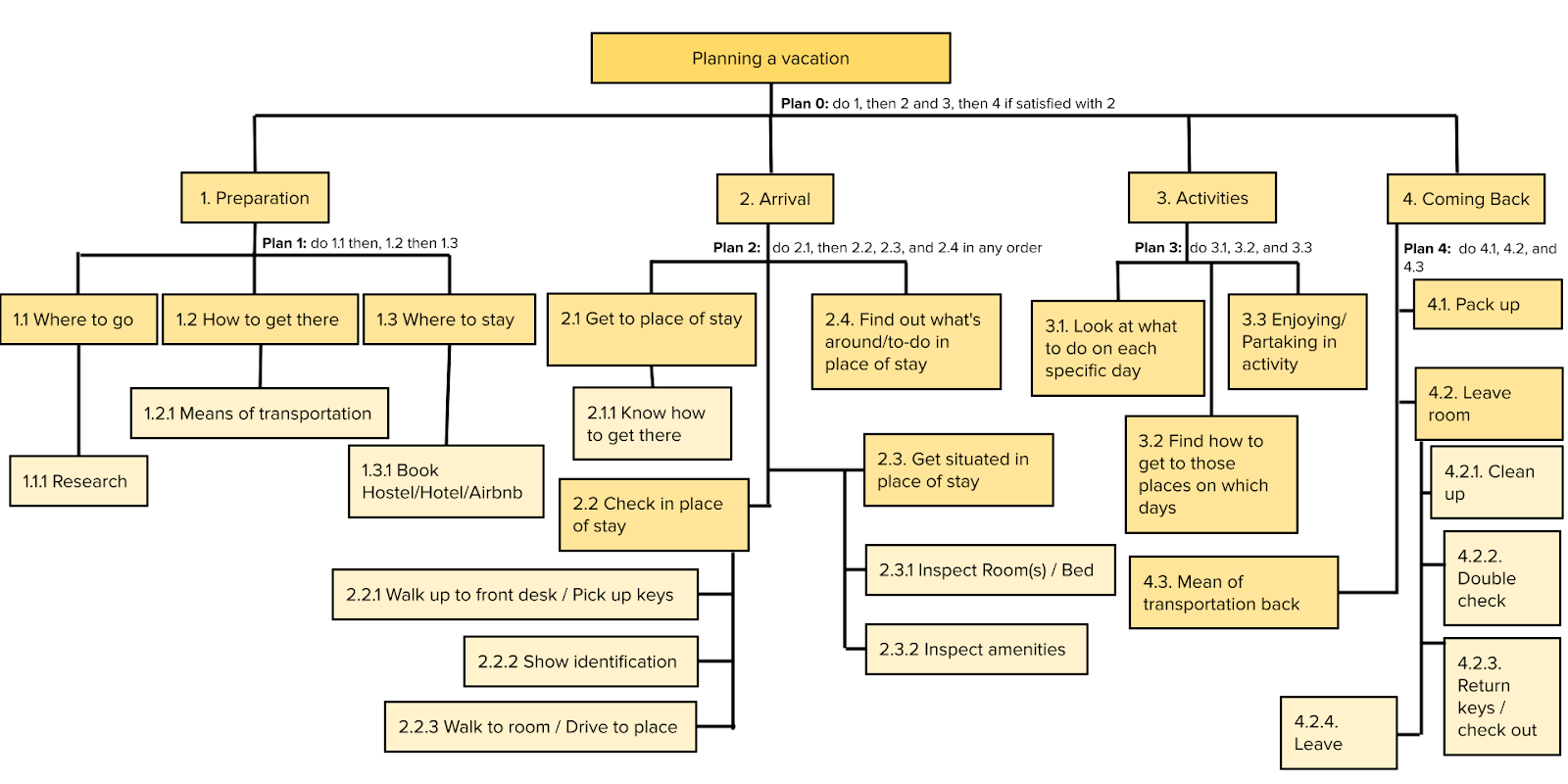
In addition to collecting information from interviews, we used our own knowledge of vacation planning and traveling to detail three tasks that help our users introduce spontaneity into the vacation planning process. These supported tasks are listed as follows:
1. Constructing and planning a full day of blocks for a vacation — A user wants to block out a full vacation day, a sort of skeleton of how the day will go, but they don’t want to pick specific activities to do. They fill it out with activity categories, such as educational, exercise, eating, museums, swimming, and more.
2. Choosing a vacation day path for a specific block — When the time arrives for a specific block, the application presents choices from which a user chooses a specific one.
Curated/Suggestion of checking out 3 nearby geolocated activities (Includes a map that shows the location of different activities, Suggests activities that are available near the user’s current location, Chooses either one of three options or can completely randomized choice)
3. Notify the user of unique events — The user can look at the app to see what limited time/popular events are occurring, such as big concerts and special exhibitions at a museum.
Observational studies and interviews
In order to collect more information about our target users, we conducted a few interviews with questions surrounding the theme of vacation planning, vacation experiences, and spontaneity. We sought out two 18-30-year-old people of any gender that have a lot of experience traveling and planning vacation trips. We picked this group as our target audience because we assumed that younger vacation travelers would be more interested in spontaneity and trying more activities outside of their comfort zones.
Interview plan:
Introduction:
1. Who we are (undergraduate UC Berkeley students in CS 160 — a course about user interface design and human-computer interaction)
2. The purpose of this interview (to seek insight into why people take vacations, how they prepare for them, and how vacation travelers feel about spontaneity)
3. With this information we just shared, would you like to participate in the interview?
The questions:
1. How early do you plan vacations?
2. Do you like having detailed plans beforehand, why or why not?
3. Why do you like going on vacations?
4. What do you define as a good/successful vacation?
5. What do you define as an unsuccessful/bad vacation?
6. How much do you value adventure/exploration/spontaneity in your vacation?
7. What do you use to plan your vacations?
Conclusion:
1. Thank the participant for their time.
From these interviews, we gathered that vacation travelers tend to schedule necessities such as lodging and food as early as a few months in advance, but leave most detailed activity and leisure planning to the last minute or do not plan in advance at all. We also learned that people who plan group vacation trips tend to prioritize the well-being of everyone around them, which defines a “good” or “successful” vacation for them. A secondary matter of importance is being able to relax and try new things. Lastly, these interviews informed us that vacation travelers prefer a good balance of planning and spontaneity in their experiences on vacation — it’s important to them to have some control over what they do on vacation, but are also open to new activities.
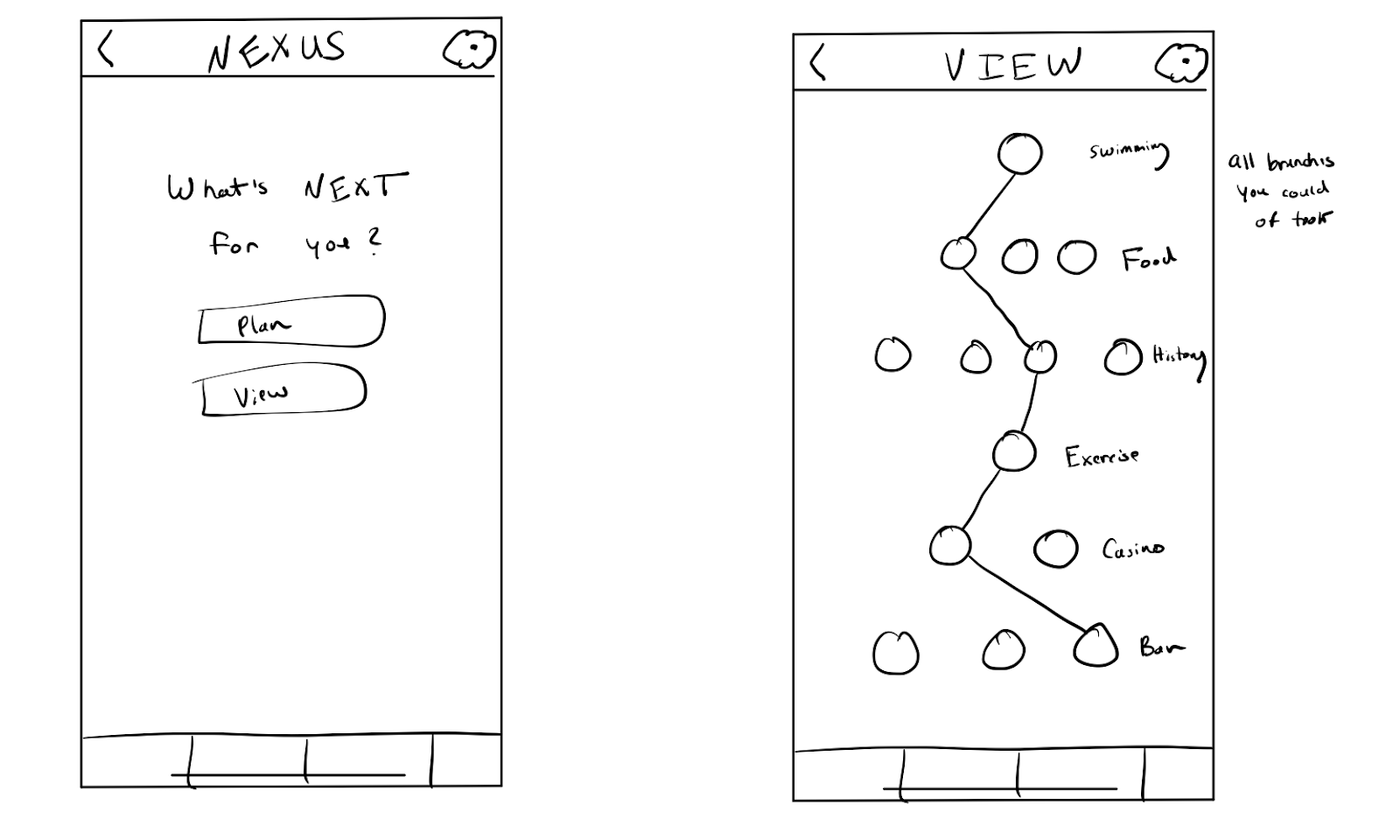
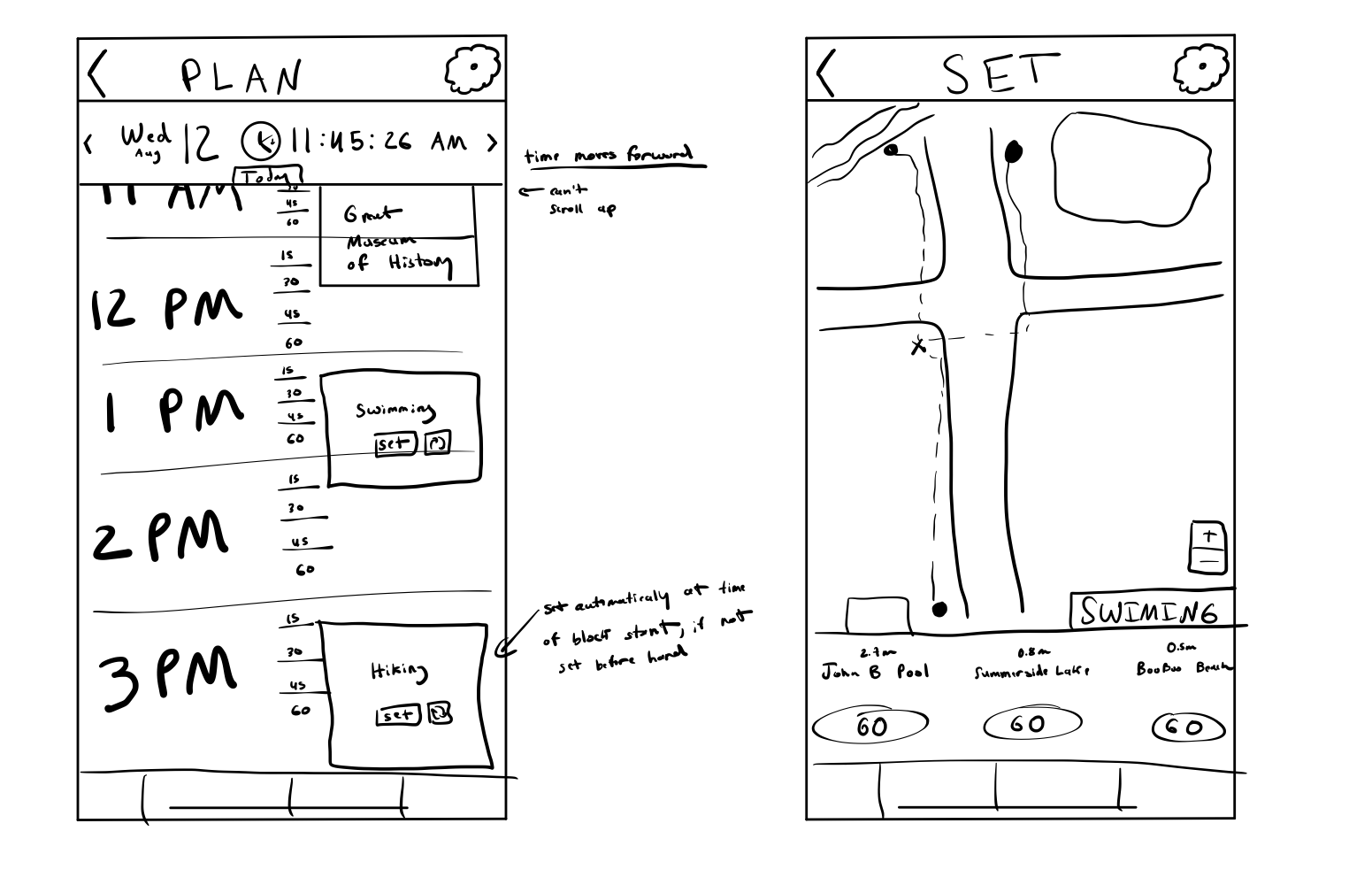
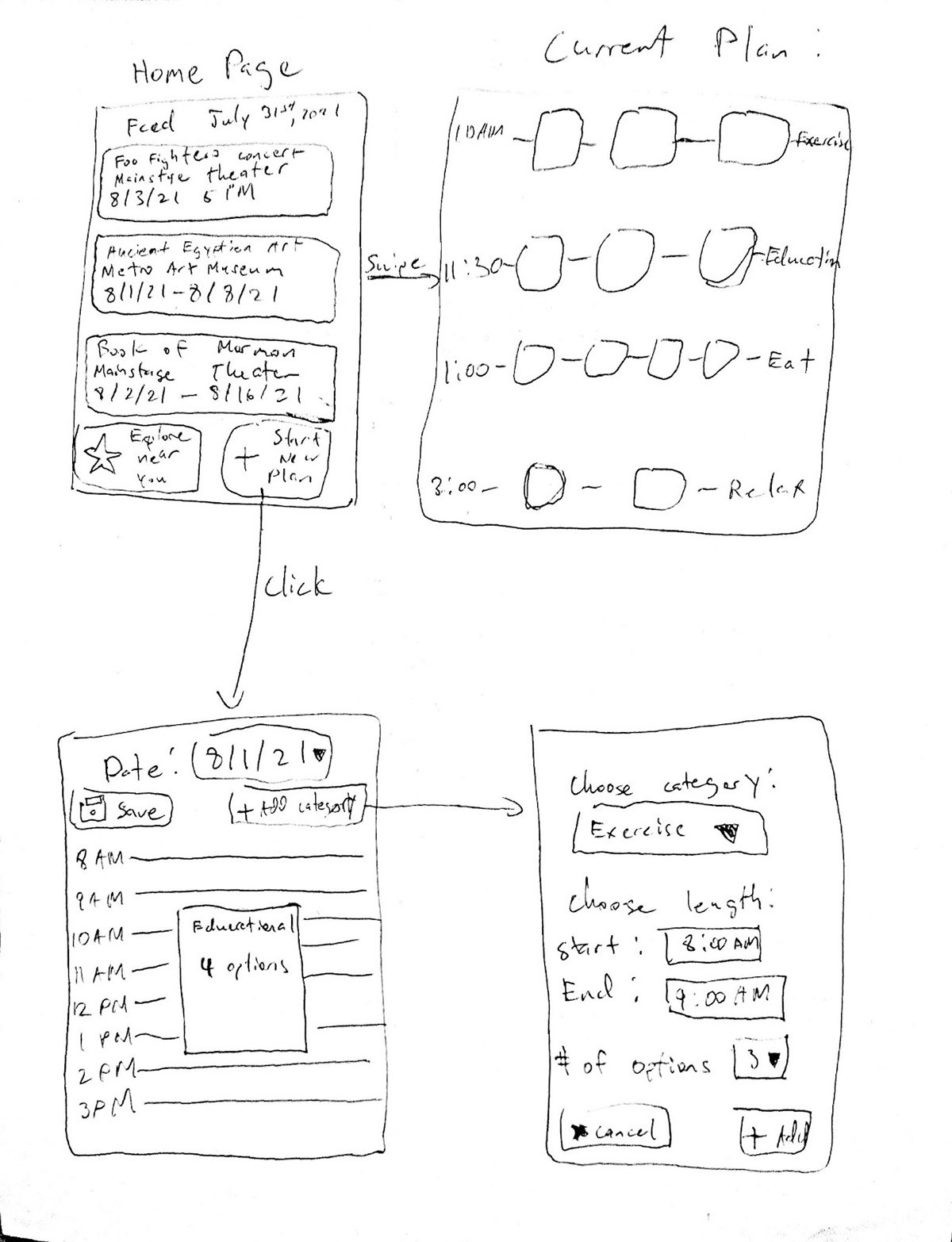
Sketches
These are the first low-fidelity sketches that we developed from the initial task analysis we performed.

Personas
Jerry is a carefree young adult. He’s always waiting for his next vacation to have fun and stay carefree. He’s a spontaneous person, thus a fixed schedule usually doesn’t work on him. Jerry has a lot of friends but he only hangs out with them on the weekdays after work. Every time he gets the chance, Jerry always goes on a road trip or a vacation trip alone. He likes the isolation where he can be alone for at least a whole day. He enjoys nature — mountains, waterfalls, beaches but he doesn’t skip the human-made structures. He also likes architecture and art as long as he’s enjoying it alone.
A couple of years back, he went to Paris to get into some of the cultures there, and of course, he went there alone. He didn’t have any plan in mind and just went with it. He met a couple of French people there but they just stayed acquaintances and it was just for small talk. In the first couple of days, he just googled some of the places that are very popular. In those couple of days, he talked to some locals and got some ideas for the next couple of days. As he went there for the next couple of days he found new people and got more ideas. This cycle went on until he went back home.
Every month, Stacy and her friends have a road trip to completely cover the U.S. map cities with checkmarks. She always has a vague plan on where the next checkmark should be and what they will do there but never has any idea on where exactly they are going to go there. It was always a fun trip with friends to alleviate the stress of the month and just to travel all over the US. In those places, she always uses Google to find places that are worth taking a look at and reading people’s reviews.
Her last trip was going to some of Montana’s national parks where she had one of her best stress reliever trips. They went there with only some clothes and their phone and it was up to Google to find their way around Montana.
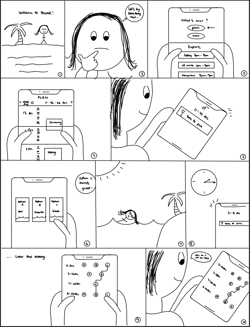
Storyboards
These personas helped us create a storyboard, which is an important part of our design process that allowed us to visualize the settings in which our users would interact with our application and how they would use it. Storyboarding helped us envision the final result of our project and helped steer us in the right direction when implementing the application.
Narrative scenarios
In order to dive deeper into understanding our persona and target user group, we developed a narrative scenario, which is a description of how a user interacts with our application in a particular setting or applies it to one concrete storyline. We decided to develop a narrative scenario for Jerry, the first persona we created.
The next trip Jerry takes is to Miami so he can enjoy the beaches. On this excursion, he wants to have a companion with him who can make suggestions for places of interest. However, he does not have any friends who can accompany him on his trip, so instead, he downloads our vacationing app. Upon arrival in Miami, he settles into his hotel and opens the app to begin exploring the options around him. He uses the planning feature to block out some relaxation time for the afternoon and some eating time for dinner. He sets up 3 options for the relaxation event and indicates that he leaves the dinner event entirely up to the app. After finishing up with the app, he unpacks and showers.
After his shower, the time comes for his relaxation event. The app notifies him of 3 options around him: a casual walk down the beach a couple of blocks away, reading and drinking in the rooftop lounge area, and a nice swim in the hotel pool. Given that he had already showered, Jerry decides to head to the lounge area, selecting that option in the app. After a couple of hours, it is time for the dinner event. The app picks out a popular new fusion restaurant on the waterfront, informing Jerry that a reservation has already been made and providing directions. Jerry arrives on time for his reservation and enjoys a delicious dinner with a beautiful view of the ocean.
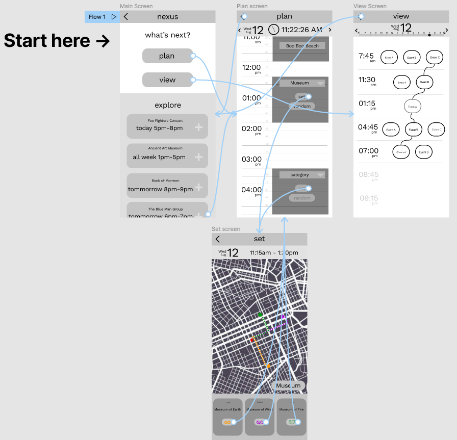
Figma wireframes
The next step in our design process was to develop low- and mid-fidelity wireframes, which are simplistic diagrams portraying some of the main interactions our application will support. We created these wireframes based on all of the previous information we had gathered from our brainstorming, interviews, sketches, and personas.
User-free evaluations
We also chose to perform a cognitive walkthrough of our first Figma wireframe, which is a tool in user interface design that allows designers to imagine a user’s thoughts and actions when engaging with an interface. When using this tool, we pretended to be the user and walked through the three tasks our prototype intends to support.
Task 1 (Constructing/Planning a full day of blocks for a vacation)
1. What outcome is the user trying to achieve and is it the intended goal of the system?
Adding activity to the plan/schedule, the action available is the same as the user goal. Yes.
Adding activity to the plan/schedule, the action available is the same as the user goal. Yes.
2. Will the user notice that the correct action is available to them?
Yes, users will realize because how they can get it is by clicking the time.
Yes, users will realize because how they can get it is by clicking the time.
3. Will the user associate the correct action with the outcome they expect to achieve?
Yes, after they click the time they want to add it will direct to “Set screen”, where the user can choose and add the activity.
Yes, after they click the time they want to add it will direct to “Set screen”, where the user can choose and add the activity.
4. If the correct action is performed; will the user see (on the interface) that progress is being made towards their intended outcome?
Yes, a block of activity set-up will pop up and the screen will change to “Set screen”.
Yes, a block of activity set-up will pop up and the screen will change to “Set screen”.
Task 2 (Choosing a vacation day path for a specific block)
1. What outcome is the user trying to achieve and is it the intended goal of the system?
Choose the activity that they want to do and select the one they want the most. Yes.
Choose the activity that they want to do and select the one they want the most. Yes.
2. Will the user notice that the correct action is available to them?
Yes, users will notice options(3 places of the chosen activity and a “Go” button) available at the bottom of the screen, pressing “Go” will set the event.
Yes, users will notice options(3 places of the chosen activity and a “Go” button) available at the bottom of the screen, pressing “Go” will set the event.
3. Will the user associate the correct action with the outcome they expect to achieve?
Yes, pressing Go will achieve their goal and will be added to the schedule/plan screen.
Yes, pressing Go will achieve their goal and will be added to the schedule/plan screen.
4. If the correct action is performed; will the user see (on the interface) that progress is being made towards their intended outcome?
Yes, it will be added to the schedule/plan screen and the user will notice the event they chose is added.
Yes, it will be added to the schedule/plan screen and the user will notice the event they chose is added.
Task 3 (Notify the user of unique events and option to add them to their daily planner)
1. What outcome is the user trying to achieve and is it the intended goal of the system?
Showing users unique events around them through “explore” and the option to add the activity to the daily planner. Yes.
Showing users unique events around them through “explore” and the option to add the activity to the daily planner. Yes.
2. Will the user notice that the correct action is available to them?
Yes, there is a plus icon(icon that shows that they can add the activity to the schedule), to add the activity to the planner.
Yes, there is a plus icon(icon that shows that they can add the activity to the schedule), to add the activity to the planner.
3. Will the user associate the correct action with the outcome they expect to achieve?
Yes, the user will get the outcome they expect since it will be added to the planner and they know that their action is correct.
Yes, the user will get the outcome they expect since it will be added to the planner and they know that their action is correct.
4. If the correct action is performed; will the user see (on the interface) that progress is being made towards their intended outcome?
Yes, it will be added to the schedule/day plan, the user can see the new added plan/activity in “Plan screen”.
Yes, it will be added to the schedule/day plan, the user can see the new added plan/activity in “Plan screen”.
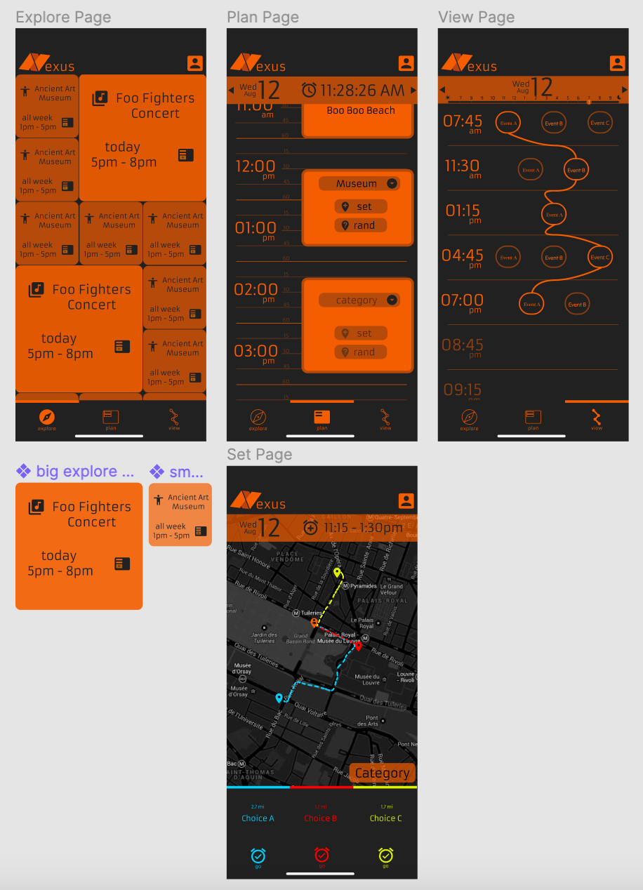
High-fidelity Figma mockups
Taking this user-free evaluation into consideration, in addition to the feedback we received from our peers, we developed a high-fidelity mockup of our application on Figma, which is a more elaborate and detailed diagram of how our project will look when it is completed.
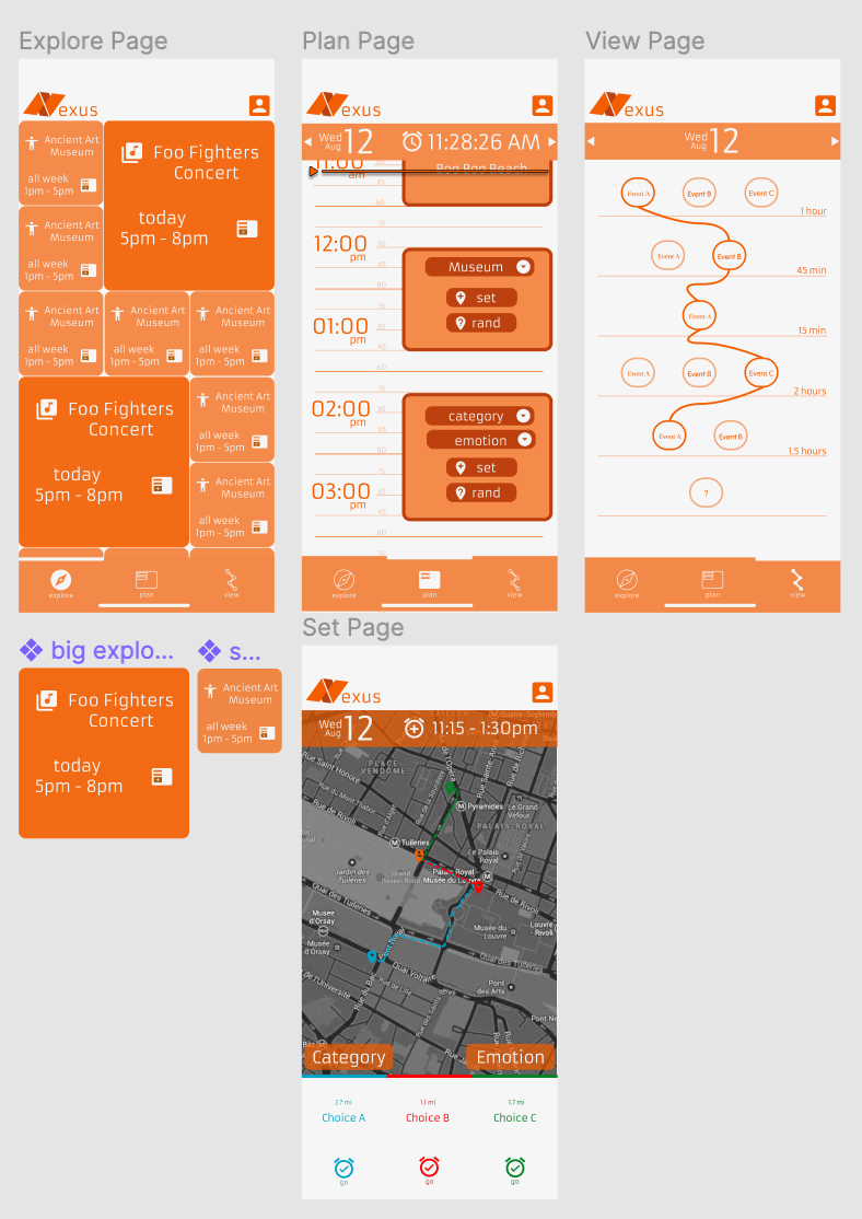
Code skeleton
The skeleton code contains a few frameworks such as jquery, bootstrap, and hammer.js for future support. There are three pages that were already set up: the explore page, the plan page, and the view page. All three of them only have a top bar that contains a logo and a profile button and a navigation bar at the bottom of the screen to swap between pages. We already made the pages in mobile view. The skeleton code also contains some SVG files that will be used for icons and a logo for future use.
Development and implementation
After adding the skeleton code to GitHub, we first implemented the plan page which connects the main interaction between all the pages. We had the plan page mostly working properly while using the local storage as the messenger between pages. Next was the explore page where we made a grid that consisted of big blocks and small blocks which are hardcoded. Once the buttons are tapped, the block’s information is stored in the local storage and will be read by the plan page to be added to the timeline. The view page was difficult to implement due to its complexity and unordered plans in the local storage. We didn’t have much time at this point, thus we didn’t implement the strings that connect one plan to the other. The last page was the set page which was just a dummy page with buttons that redirect to the plan page due to the lack of time we had left.
After getting the feedback from the usability test, we needed to change the color scheme because most of the participants said that it was hard to read. While changing the color scheme, we had an issue that while changing the icons in the file, the icons didn’t change in the website. It took us about 30 minutes to solve this problem. The problem was the old icons were stored in the browser’s cache and the solution was we needed to clear our browser cache. There was also one bug that persisted in the development stage until now — when we changed the page from any page to the plan page, all of the block plans in the plan page moved to the bottom of the timeline. Refreshing the page fixed the issue but it’s not a perfect solution because it’s decreasing the user experience.
User evaluations
After developing our first prototype and high-fidelity wireframes on Figma, we used these two tools to conduct usability tests, which are techniques used in user interface design to have real users test and evaluate prototypes. We recruited five people within our target user group to perform usability tests.
Usability test script
Thank you for agreeing to participate in this usability test! We’ll do some quick introductions about ourselves and our design project, and then we can ask about the prototype we have started to design! We are undergraduate students in a summer class at UC Berkeley about user interface design and human-computer interaction. We are currently working on a design project for those tired of rigid routines and set in stone schedules and made for the solo vacation traveler that wants to gain new perspectives and introduce some controlled spontaneity to the vacation planning experience. Our app seeks to deconstruct free will, the paradox of choice, and one’s true values. It reconstructs how a typical planner application operates by enabling you to plan and execute your day as it happens and not always anticipate what lies ahead. The app allows one to plan out the skeleton of a vacation day, introduces one to spontaneous choices for an event or activity, shows one’s alternate paths for a specific day, and enables one to explore and execute unique and time-sensitive events and activities.
1. What are your initial thoughts about the app design and interface when you first open it?
2. Imagine a scenario where you want to block off a period of time to go swimming. Can you please walk me through how you would go about accomplishing this task?
3. What are the most noticeable differences between using this application and how you plan other vacation trips?
4. How does this application inspire spontaneity for you?
5. Imagine a scenario where you previously blocked off a time for swimming and the time has arrived. You receive a notification to pick your activity, can you please walk me through how you select your activity from the set page?
6. Are there any parts of the interface that seem confusing or unintuitive? Are there any features you wish were available but aren’t?
7. Is there anything else you’d like to add?
Thank you so much for your time! Your feedback is going to be super helpful in future versions of our application.
From our usability tests and evaluations, we learned that we are on the right track in implementing an application that inspires spontaneity for vacation travelers who are interested in diversifying their normal travel experience and plans. Our usability test participants expressed that this application has a unique concept that is not seen in other trip-planning applications — specifically, some of our users expressed appreciation for the ability to see multiple possible destinations at once on the set page with the map, as well as the ability to reflect on trips and possibly other activities that could have been done with the view page.
However, we also gained valuable insight from our usability tests when some of the implemented features of our application and design were not interpreted or translated to the users the way that we intended for them to. Some examples include our color scheme, which was intended to be striking and unique but ended up causing some readability issues for a few of our participants, or our view page, which was intended to give a clear layout of decision history but ended up confusing some participants with its structure. The feedback we received on these pain points was carefully considered and integrated into our prototype when we progressed from our wireframe mockup to our final implementation.
Some interviewees also made some highly interesting suggestions for potential features in the application, including Interviewee 4, who suggested that we provide the option of creating event blocks with no set end time, or interviewee 3, who suggested implementing the ability to push set blocks back to a different day. There are many functions that can be explored within our applications design space, and it was deeply insightful to learn which of these functions were most desired from our user base. If time allows, future iterations on our prototype will take these desires into consideration.
High-fidelity Figma wireframe revisions
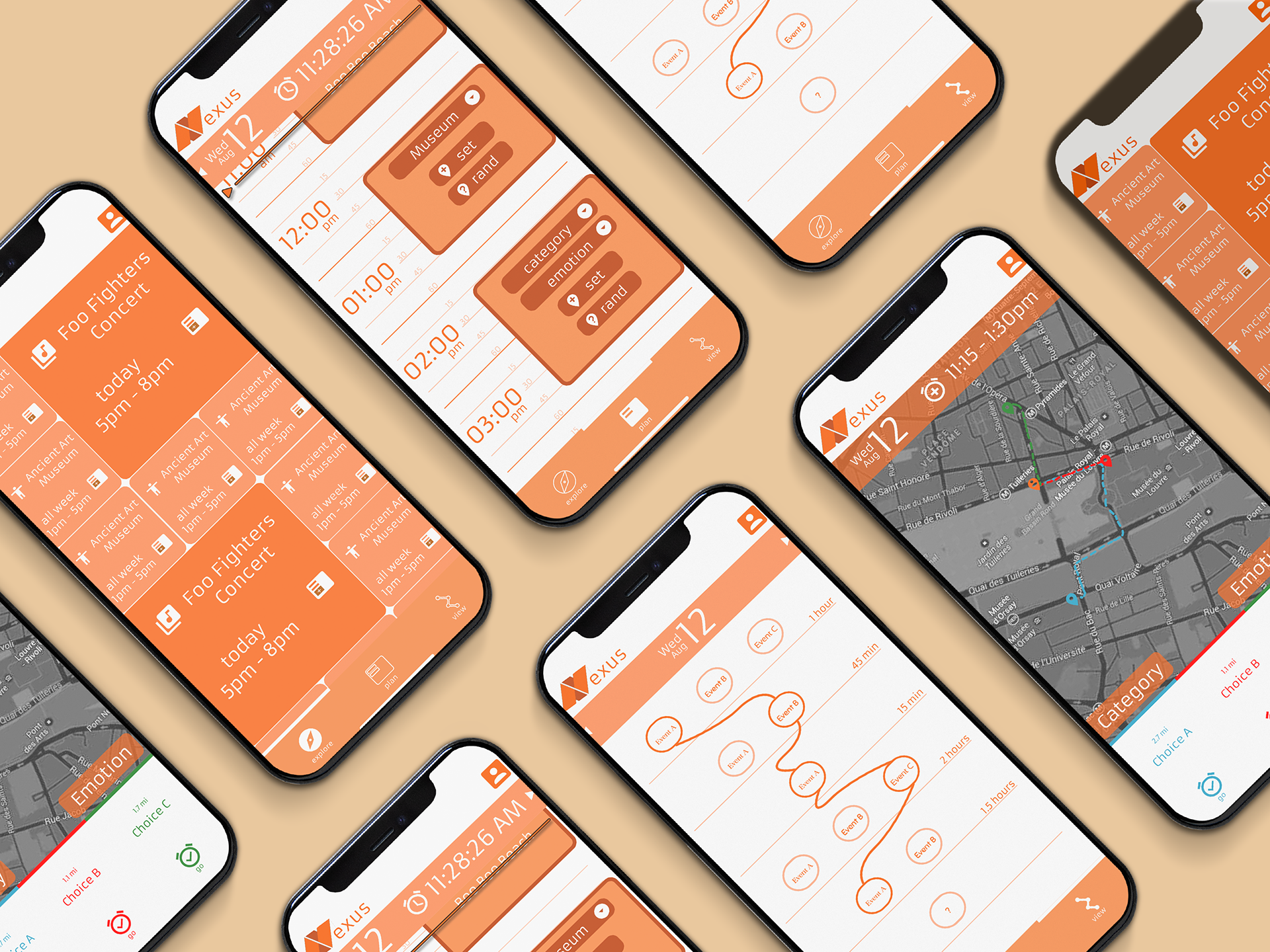
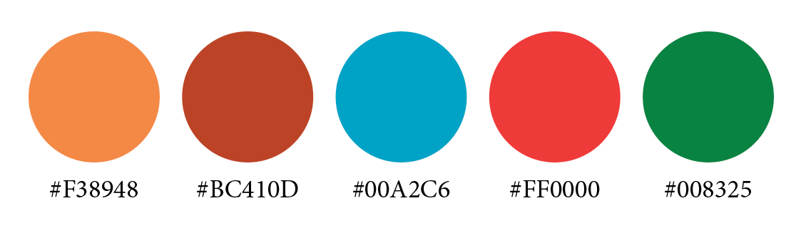
The following screenshot reflects the visual design changes we implemented after conducting usability tests and receiving feedback about the inaccessible color scheme.
Visual Design
Color Palette
Typography

Conclusion

Referring back to our original problem statement that we intended to solve with Nexus, our application is designed to present the average young, solo vacation traveler with a number of spontaneous activities to explore without overwhelming them. Revisiting our persona Jerry and the narrative scenarios we developed with how our target user group will interact with our application, in addition to the concrete user feedback we received in interviews and usability tests, we are proud to have learned that Nexus has made a positive impact on how people plan and experience their vacations.
This project was an incredible opportunity to experience the design process from beginning to end, where we formulated our ideas in the design stage, took them one step further in the prototype stage, and received critical feedback in the evaluation stage to refine our concepts and produce a final application that we are all proud of. This project provided us with valuable first-hand experience in designing solutions for real-world applications, which will be applicable to our future endeavors beyond CS 160. We’re extremely content with how our final product turned out, and are grateful to the course staff and our team TA, Noah, for all of the incredible support and guidance throughout this project.