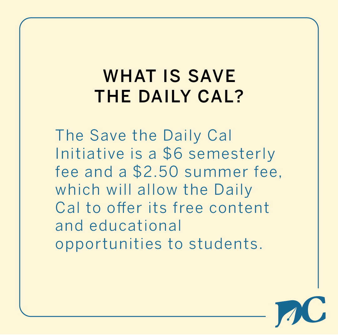
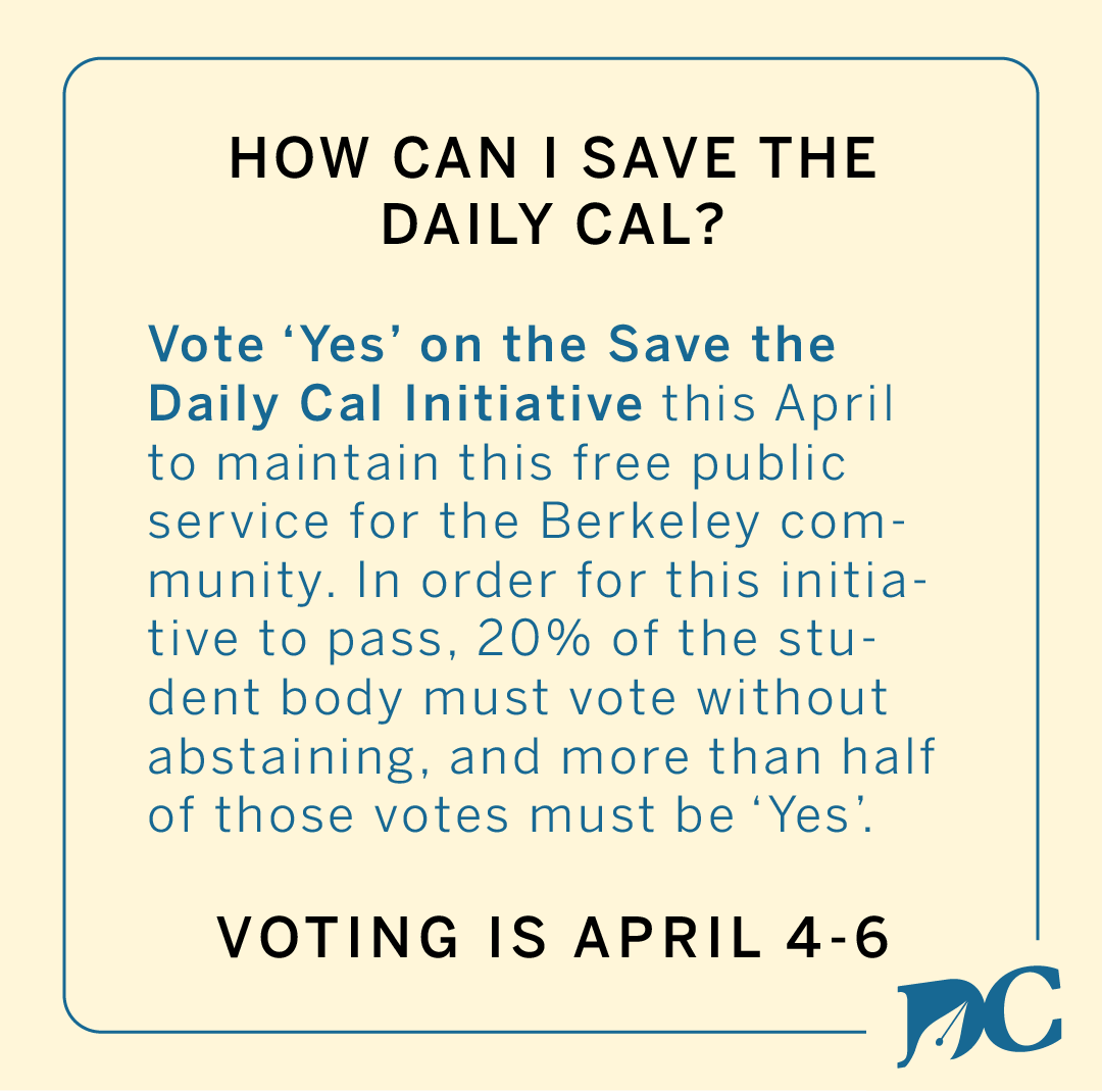
Save The Daily Californian (SDC) Initiative
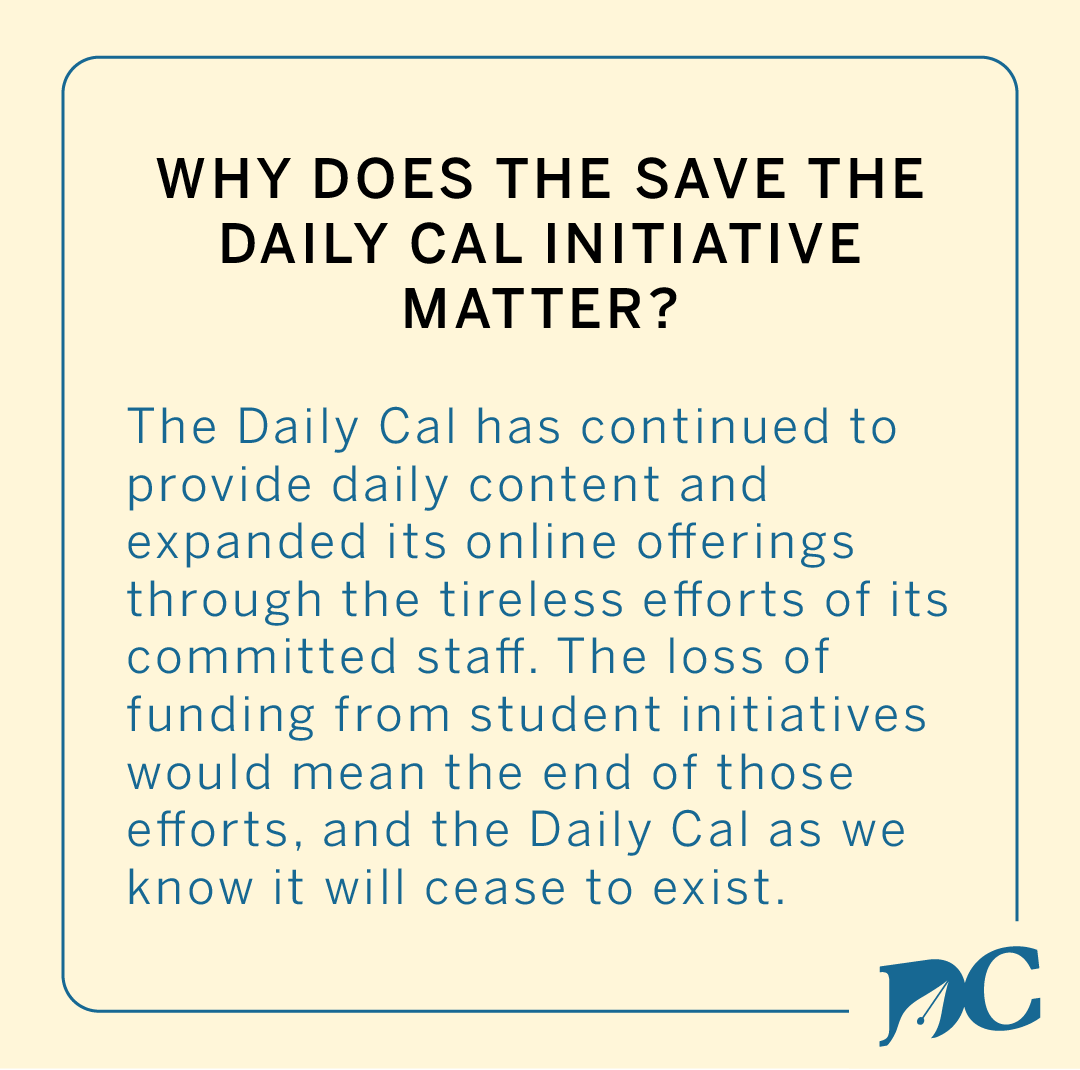
The Daily Californian, the city of Berkeley’s newspaper of record, is facing extinction after 150 years. UC Berkeley students are allowed to support the Daily Cal every few years through voting on initiatives that provide funding to the student-run newsroom, such as the V.O.I.C.E. Initiative in 2012 and the Ink Initiative in 2016. These initiatives provide the publication with essential funding to keep delivering breaking news content through online and print mediums and keep its doors open as a training ground for the next generation of journalists, designers, photographers and business people. In 2022, students will have the opportunity to vote on the Save The Daily Californian Initiative.
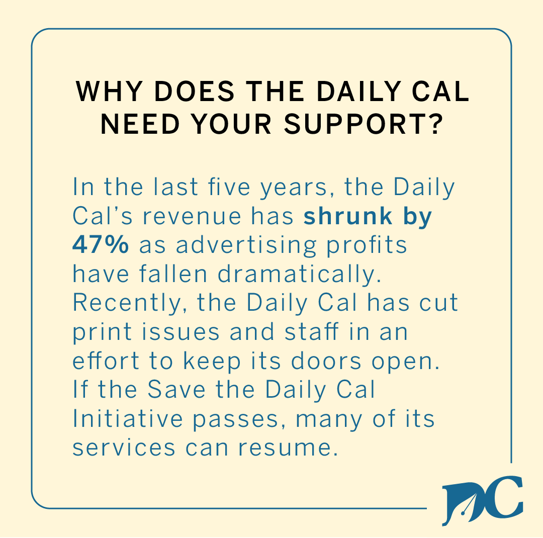
Due to the COVID-19 pandemic, the Daily Cal's revenue has shrunk by 47% due to falls in profits from advertising. In the last two years, the Daily Cal has cut print issues from four days per week to one day per week in an effort to keep its doors open. If the Save the Daily Cal Initiative passes, many of these services can resume. If it fails, what remains will vanish.
I designed campaign materials for the Daily Cal's managers, editors and staffers to spread the word about this initiative. This included flyer designs to hand out to students on campus, social media materials (including Instagram posts, Instagram stories, Facebook cover photos and Twitter cover photos) for staffers to spread awareness online, and more physical merchandise designs, such as campaign stickers and shirts. All of these campaign materials have consistent design elements that form a cohesive visual front for this initiative.
Inspiration
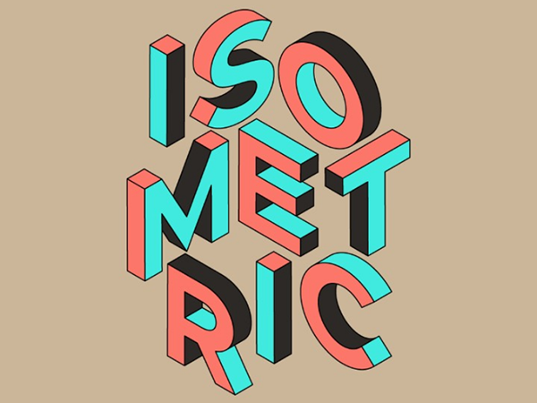

When tasked with designing the materials for this campaign, I was immediately inspired by the concept of isometric typography. I knew that the context of what I was designing was going to be text-heavy, which required me finding a way to transform the text into engaging visual elements. The Daily Californian's visual identity is largely minimalist and not very abstract, so using elaborate elements such as isometric typography was a way to distinguish this brand design from the regular editorial content published. However, it was important for me to tie this campaign back to the Daily Cal's visual identity in more subtle ways, which I executed through using typefaces and colors from the official Daily Cal design system.
Element Sketches

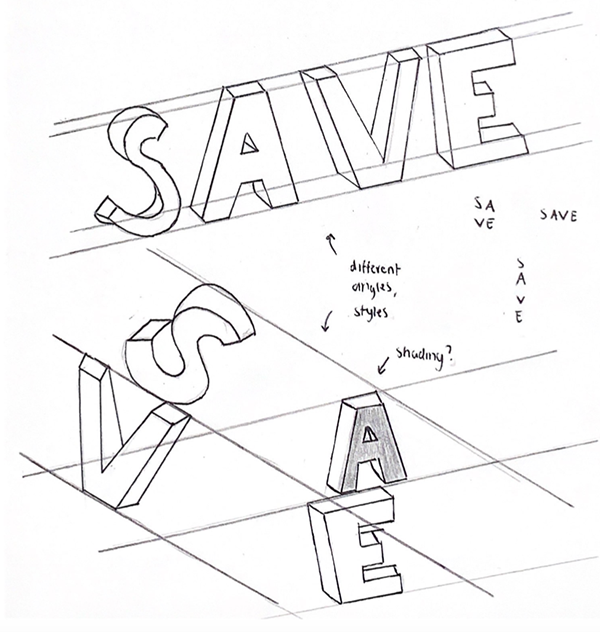
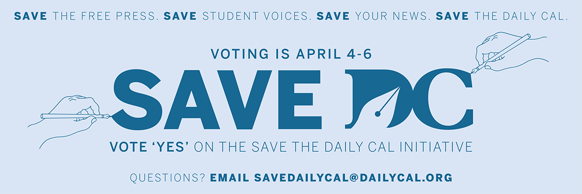
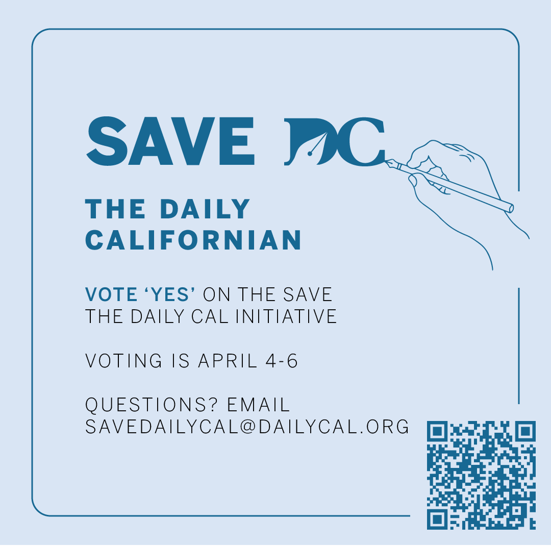
I decided to create design elements for this campaign that are a reference to the Daily Cal's official logo. The pen element represents a variety of Daily Cal staffers, including writers, editors, illustrators and more. The hand element, in addition to providing context for the pen elements, hints at the concept that the Save the Daily Cal Initiative is an "all hands on deck" emergency situation for the Daily Cal and that the staffers themselves are very "hands-on" in ensuring this fee initiative passes.
Refined Elements
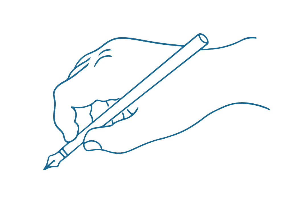

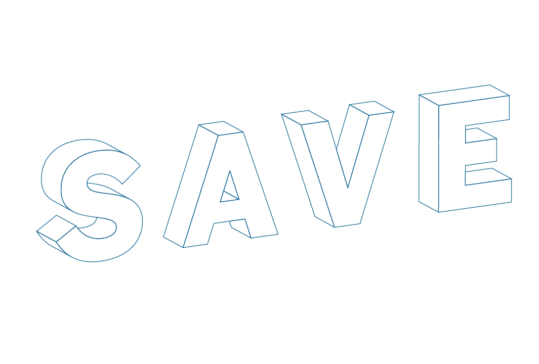
Using Adobe Illustrator, I refined my pen and hand sketches into cleaner and more consistent graphics. I used isometric typography effects to create the text-heavy elements, and I also warped the Daily Cal logo to be angled to the same degree.
Layout Sketches
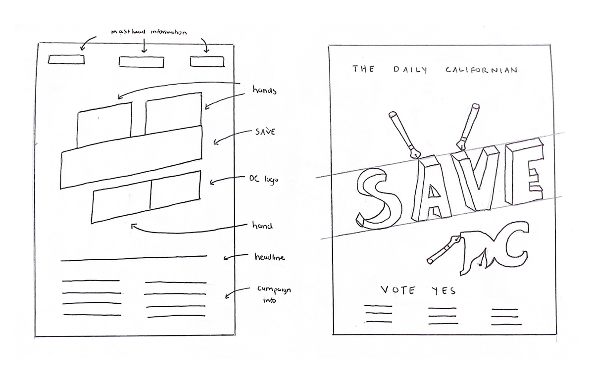
Once I finalized the elements that I wanted to use in the campaign materials, I sketched out the layout of the flyers that I had in mind. I ran through multiple options and ultimately decided to span the Daily Cal masthead across the top of the flyer, keep the rest of the campaign information towards the bottom, and use the middle section as a visual entry point to attract interest. I also experimented with different options regarding the angles of the pens and hands, in an attempt to make them look natural and fill the empty space without being too overwhelming.
Color Palette and Typography

In order to ensure that the campaign materials were tied back to the Daily Cal's design standards, I selected colors from the official palette, which is used across editorial and business departments for brand consistency. I also used BentonSans with tracking of 120, which is one of the three official Daily Cal typefaces.
Rough Drafts
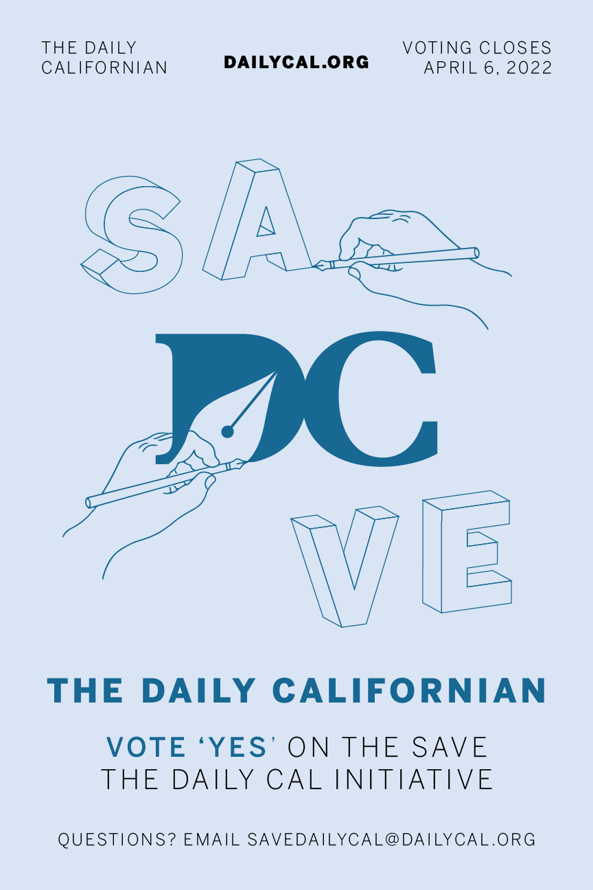
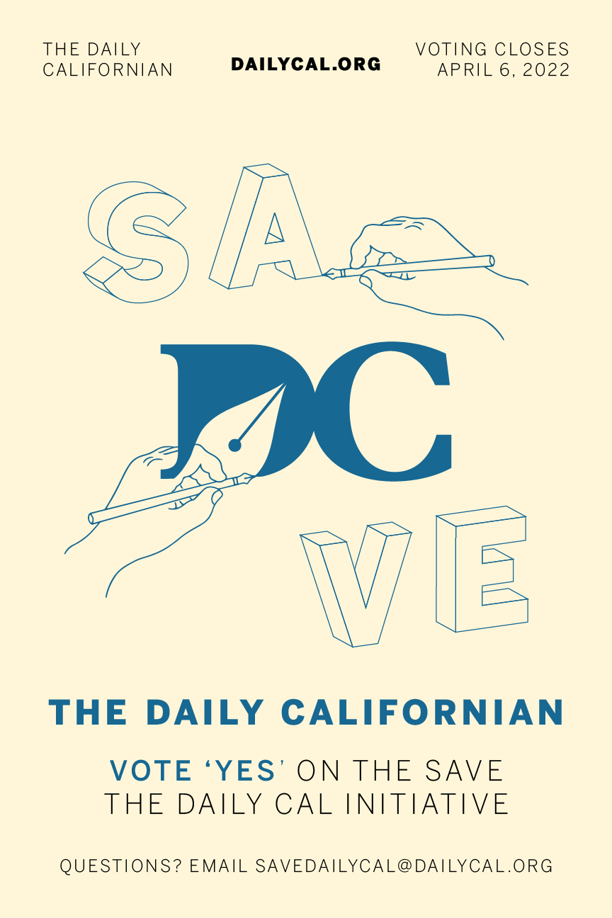

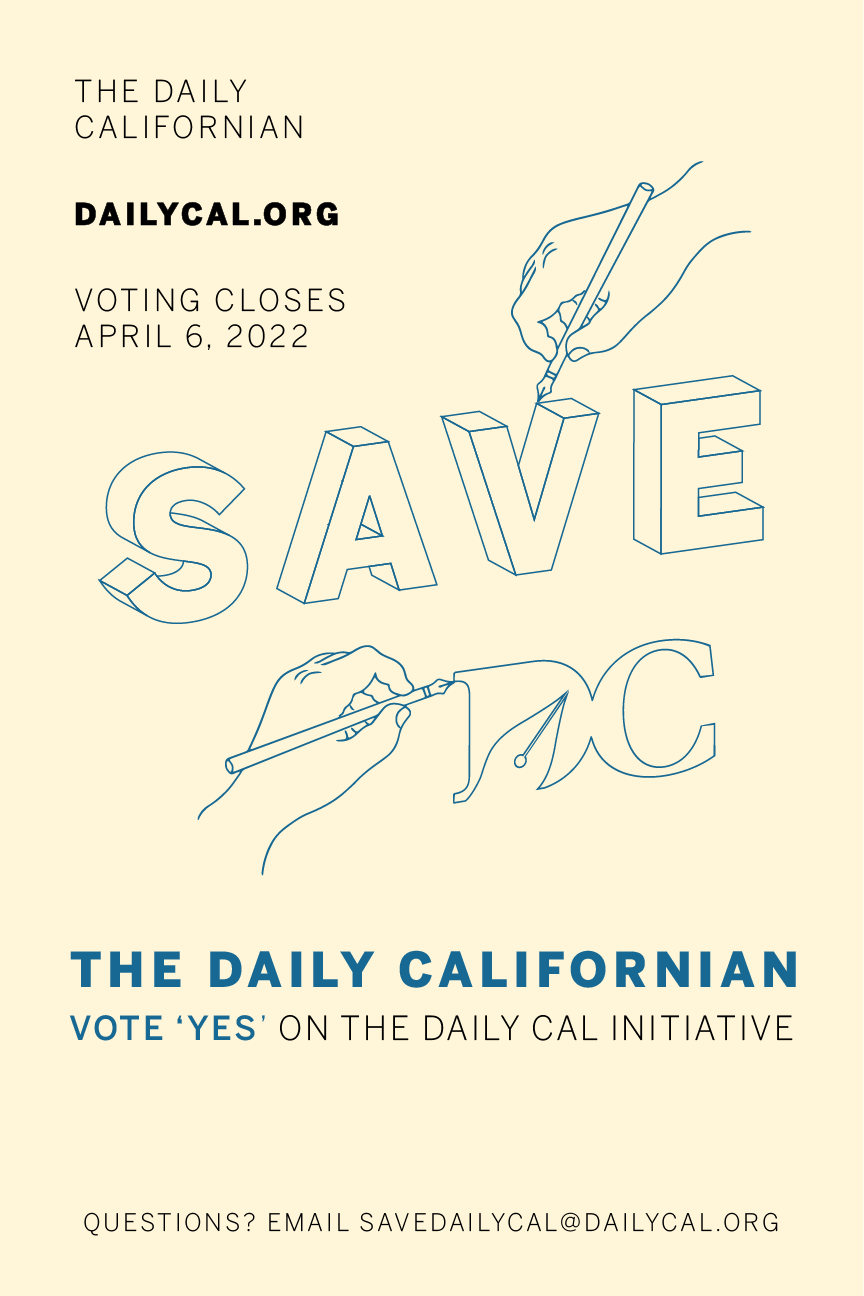

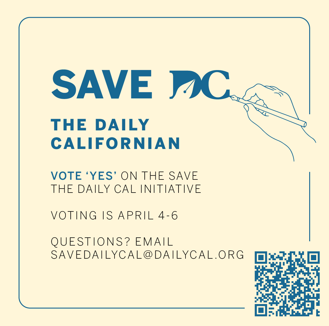
These are a few of the initial drafts that I ultimately rejected after multiple rounds of feedback and iteration. I experimented with text placement and color, arranging the typographic elements in different ways and finding a balance between stroke outlines and color-filled shapes.
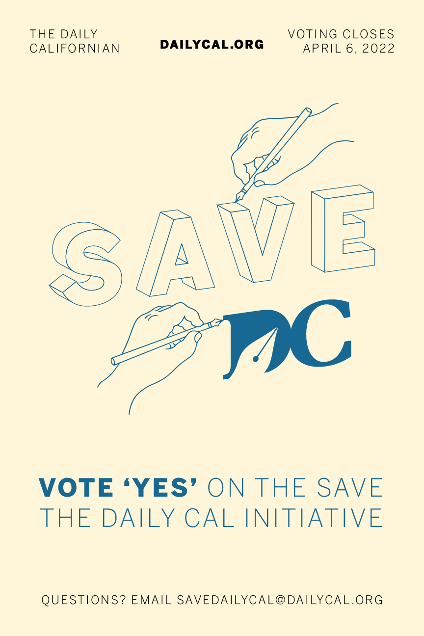
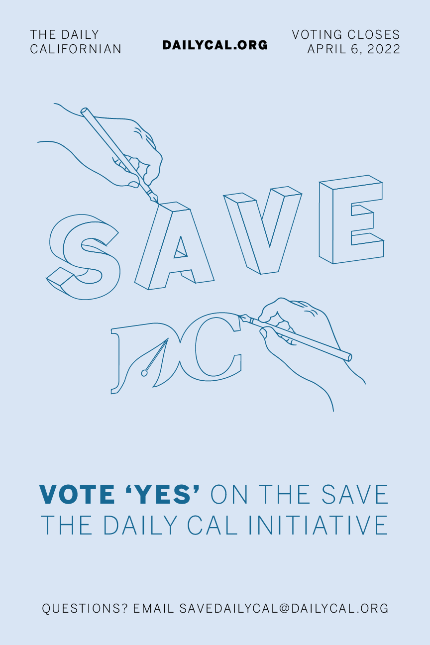
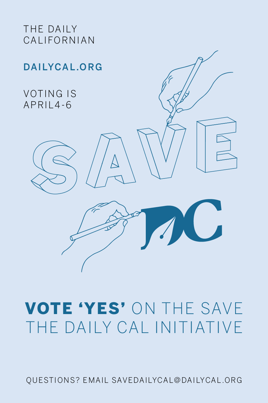
Final Drafts
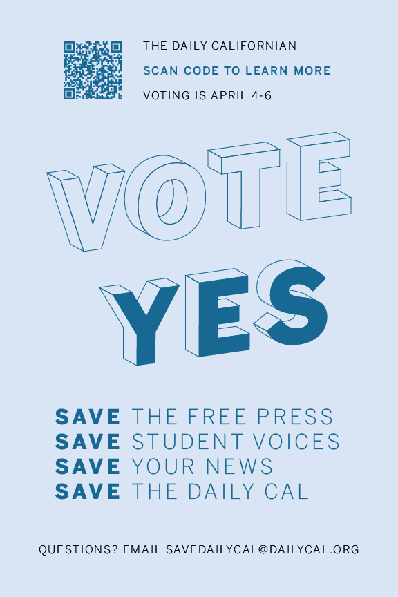
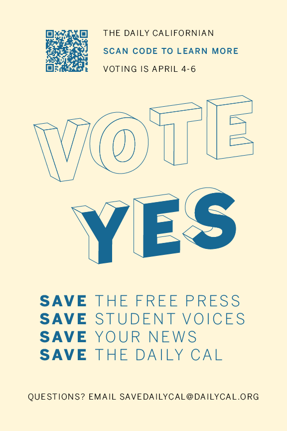
These are the final flyers that were printed for distribution for the Save The Daily Californian (SDC) Initiative. A QR code was included in the flyer that links to an article with more information about the fee, and the flyer was redesigned toward the end of the process to be double-sided and to place more of an emphasis on voting "yes" in the upcoming election.
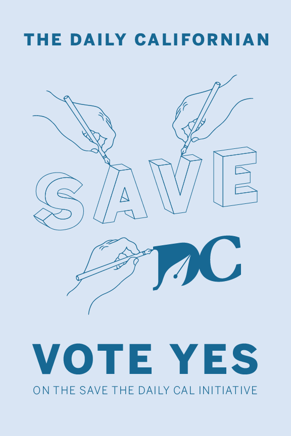
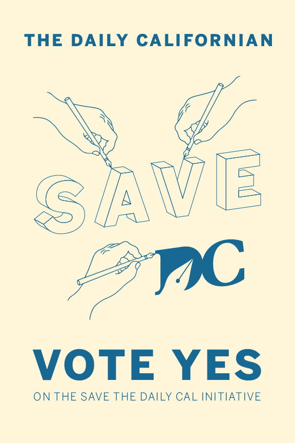
Further Iterations
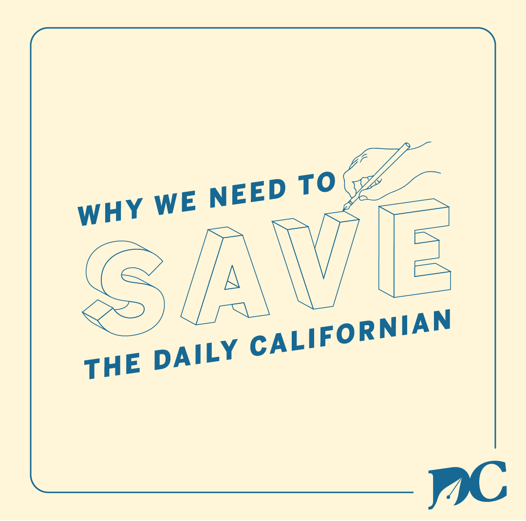


These are some of the additional materials that I designed for this campaign, which include Instagram posts for staffers to spread the word online, Twitter and Facebook cover photos and print ads to feature in the print paper.