Cafe Milano
A responsive website that allows customers to reserve seats ahead of their arrival
Cafe Milano is a coffee shop that offers high quality coffee and comfortable study spaces. The typical customer is between 18-35 years old, and most are college students or early career professionals. Cafe Milano’s goal is to create a way for customers to easily reserve a place to sit ahead of their arrival.
Project Overview
My Role
UX designer leading the Cafe Milano website design
My ResponsibilitiesConducting interviews, paper and digital wireframing, low and high-fidelity prototyping, conducting usability studies, accounting for accessibility, iterating on designs and responsive design
TimelineSeptember 2022 - October 2022
The Problem
The process of finding a seat at a coffee shop is overwhelming and stressful because there’s often no seats available. Potential customers are forced to circle the coffee shop multiple times to look for a seat, wait for an opening, or try a different place.
The GoalDesign a Cafe Milano website for customers to book seat reservations in advance by providing a quick and simple checkout process.
Understanding the User
User Research
I conducted user interviews, which I then turned into empathy maps, personas, user stories and user journey maps to better understand the target user and their needs.
I discovered that many target users prefer to study in coffee shops because they provide ample work environments. However, many are discouraged from visiting coffee shops due to the stressful and frustrating process of finding a seat to work. Many target users expressed that the overwhelming and difficult process of finding a place to sit outweighs the benefits of working in a coffee shop.
User Pain Points
1. Overcrowding: Coffee shops, such as Cafe Milano, are often overcrowded and potential customers are unable to find seats when they arrive.
2. Long Lines: Upon arrival, potential customers experience long wait times and lines to find open seating and place orders for food and drinks.
3. Variety in Seating: Potential customers want to know about their seating options and seat availability before they arrive at the coffee shop.
4. Group Reservations: Potential customers that want to work with friends or coworkers want to reserve multiple seats together at the same time.

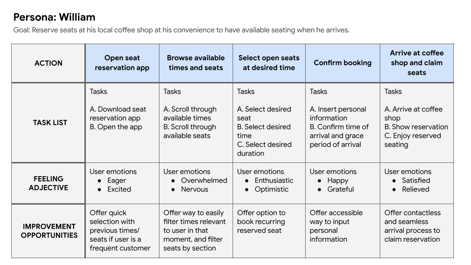
Persona: William
Problem Statement: William is a full-time college student who needs a way to reserve seats at his local coffee shop ahead of time because he wants to study with his friends when he arrives.
Starting the Design
Sitemap
Difficulty finding seats at coffee shops was the primary pain point among target users, so I used this information to construct a sitemap for a reservation website. My goal was to make strategic information architecture decisions that would make reserving seats ahead of time as quick and simple as possible.

Paper Wireframes
Next, I drafted concepts for each main screen of the user flow on paper to ensure that future digital wireframes would be well-suited to address user needs. These paper wireframes focus on keeping the reservation process as quick and convenient as possible.

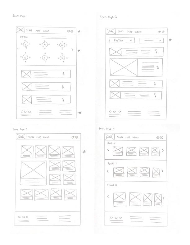
I marked the elements I wanted to carry into my digital wireframes with a star.
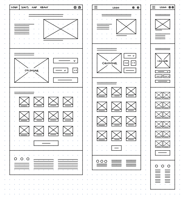
Paper Wireframe Screen Size Variations
Because Cafe Milano customers access the website on a variety of different devices, I started to work on designs for additional screen sizes to make sure the site would be fully responsive.
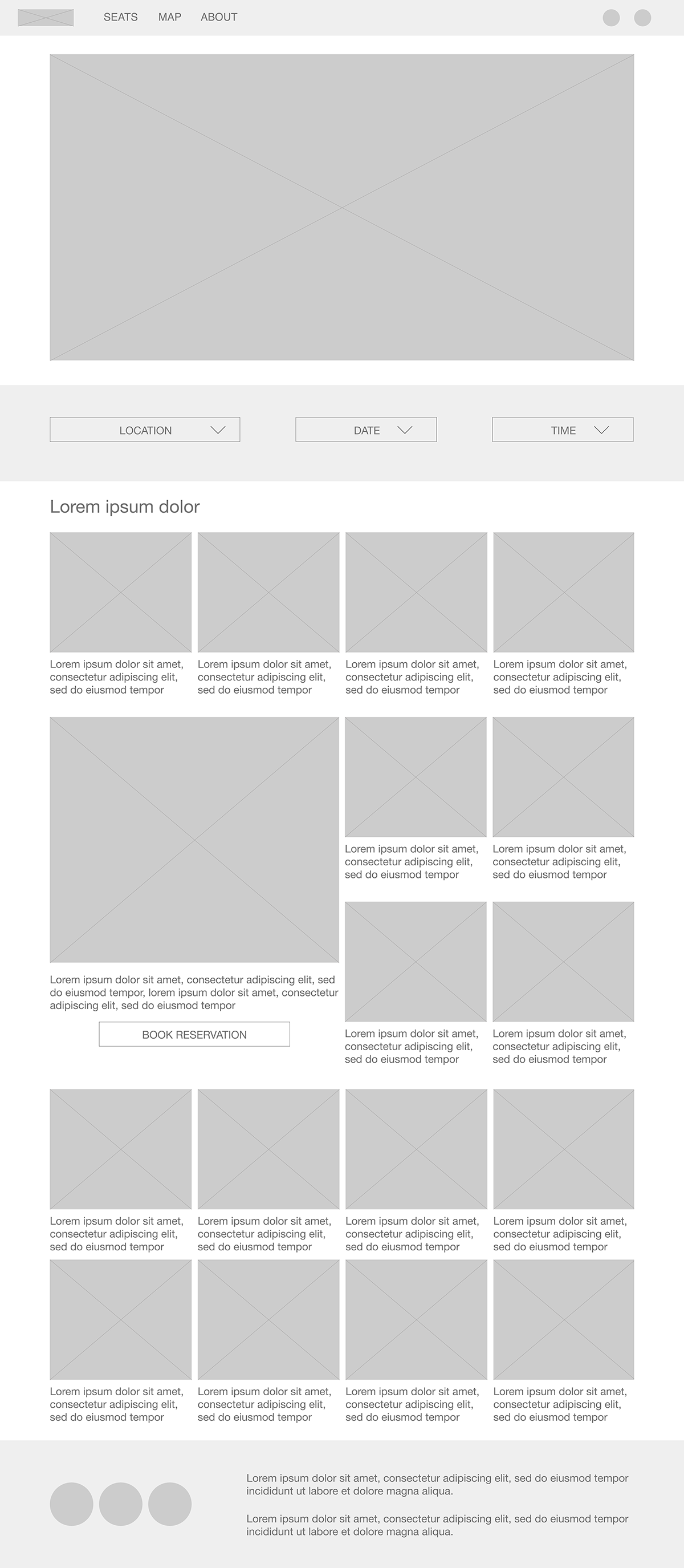
Digital Wireframes
Then I designed the first iteration of digital wireframes to help address user pain point of finding a place to sit at Cafe Milano. I prioritized useful button locations, visual element placement and typographical hierarchy on the home page to make it easy to begin the process.


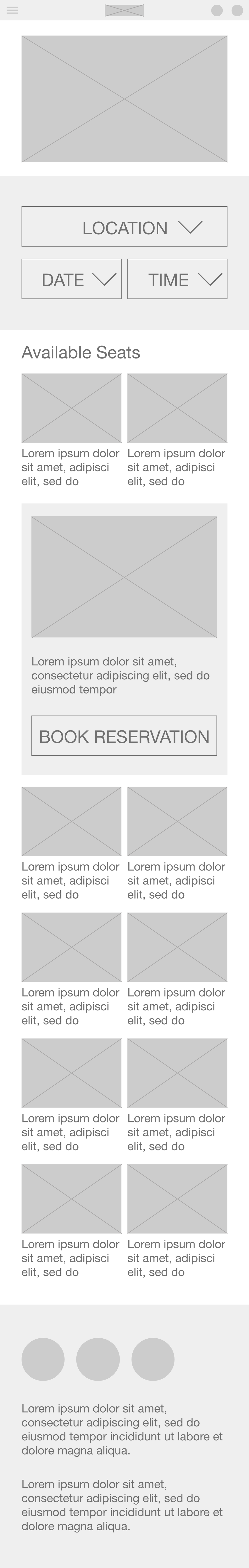
Digital Wireframe Screen Size Variations
Keeping responsive design at the forefront of my mind throughout the design process included constructing wireframes for multiple screen sizes for each iteration. This helped me ensure that the user experience would be of high quality on multiple devices. Below are digital wireframes of the home page and the available seats page for mobile screens.

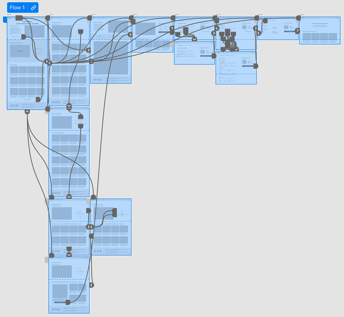
Low-Fidelity Prototype
To create a low-fidelity prototype, I connected all of the screens involved in the primary user flow of selecting a seat to reserve and checking out. I also connected screens with basic back navigation and made the top navigation bar functional.
View the low-fidelity prototype here.
Usability Studies
I conducted a round of usability studies after constructing my low-fidelity prototype, which helped determine where my designs were successful in meeting user needs and where further iteration was required.
Findings:1. Visual Cues: Once on the available seats page, users didn’t know how to view their options and wanted more visual cues to direct them.
2. Navigation: Users were frustrated with the lack of clear navigation to move backward in the reservation user flow.
3. Multiple Reservations: During the checkout process, there wasn’t a simple way to add multiple seats to the same reservation order.
Refining the Design
Mockups
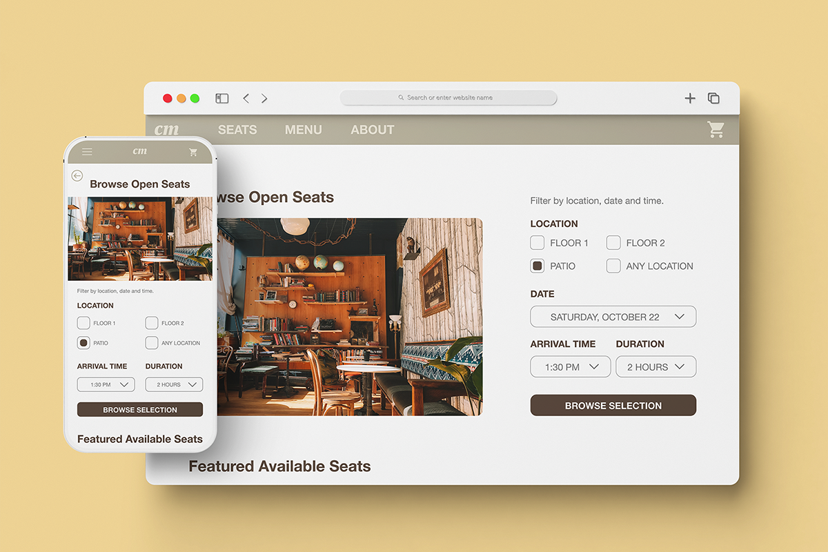
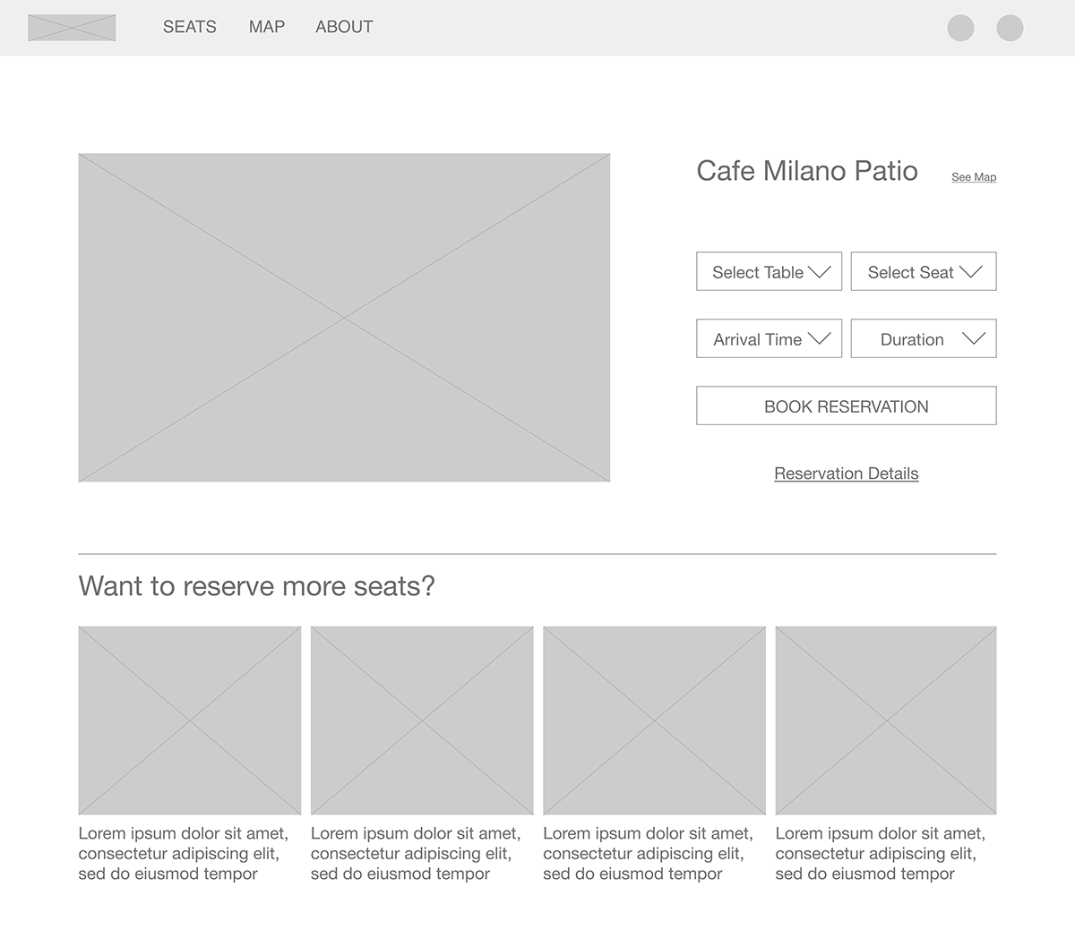
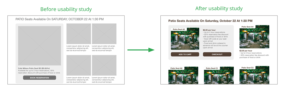
To make the available seats page easier to navigate, I added visual cues to direct them to next steps and included explicit back navigation buttons. I also added more custom filtering options which users expressed a desire for during usability testing.
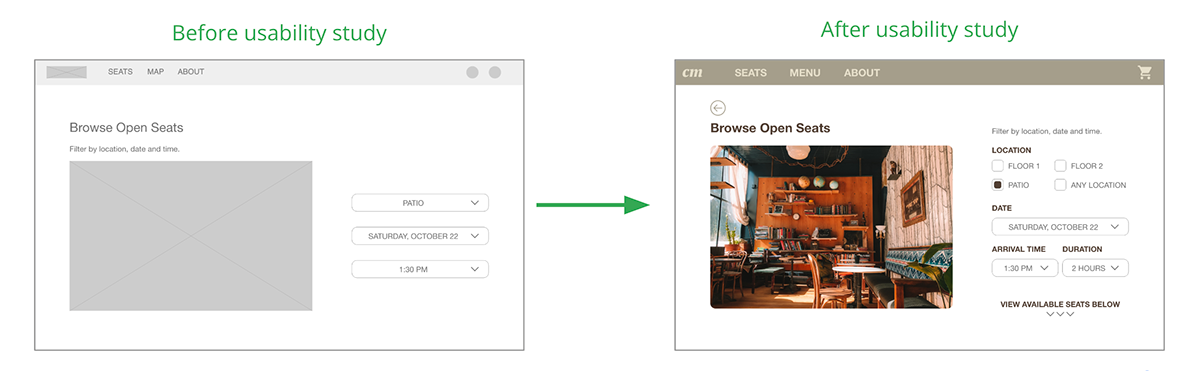
I adjusted the filtered results page based on usability testing insights by redesigning the pop-out card to include more information. I also included the option to add the selected seat to the user’s cart to reserve multiple seats at once or quickly check out with the selected seat.
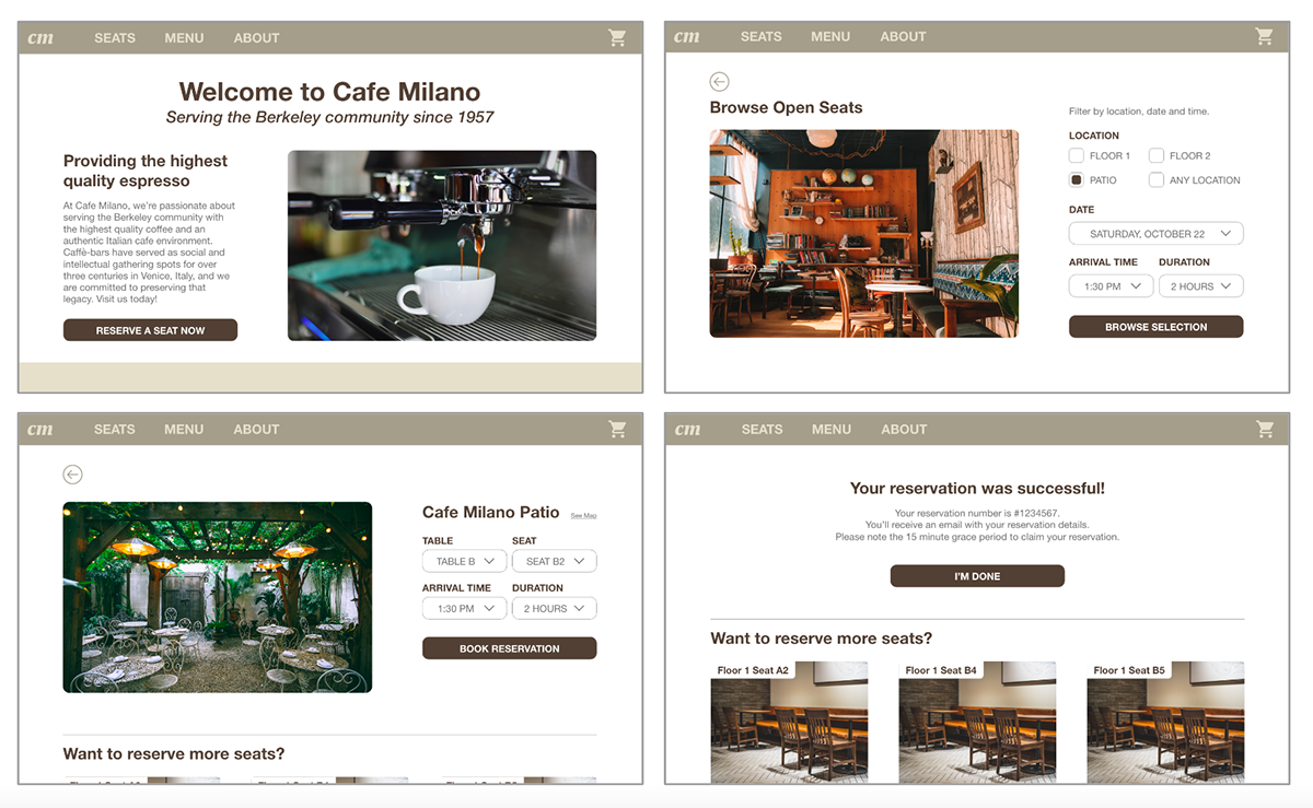
More Mockups (Desktop Screen Size)
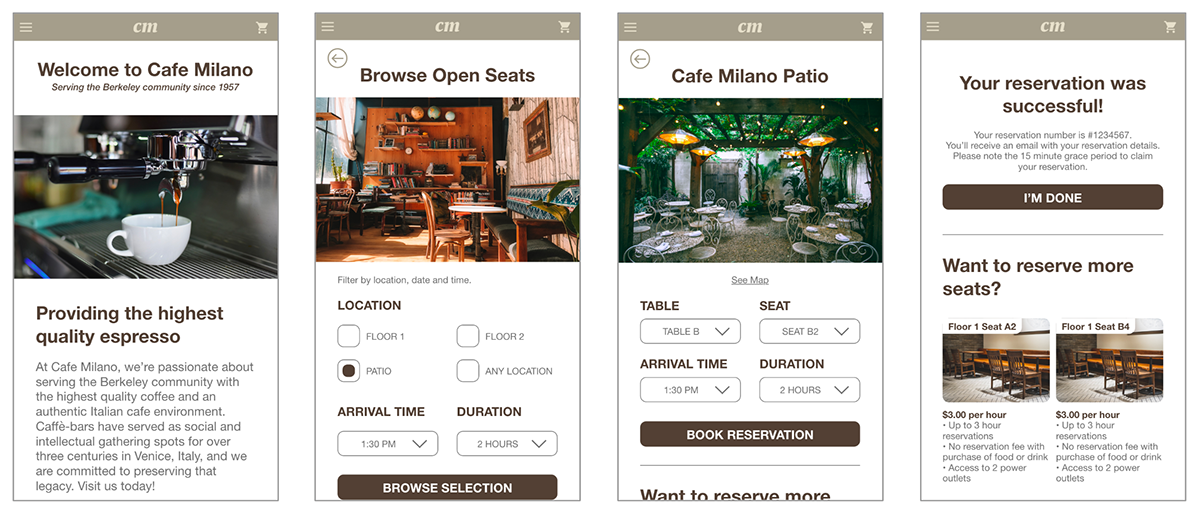
Mockups for Screen Size Variations
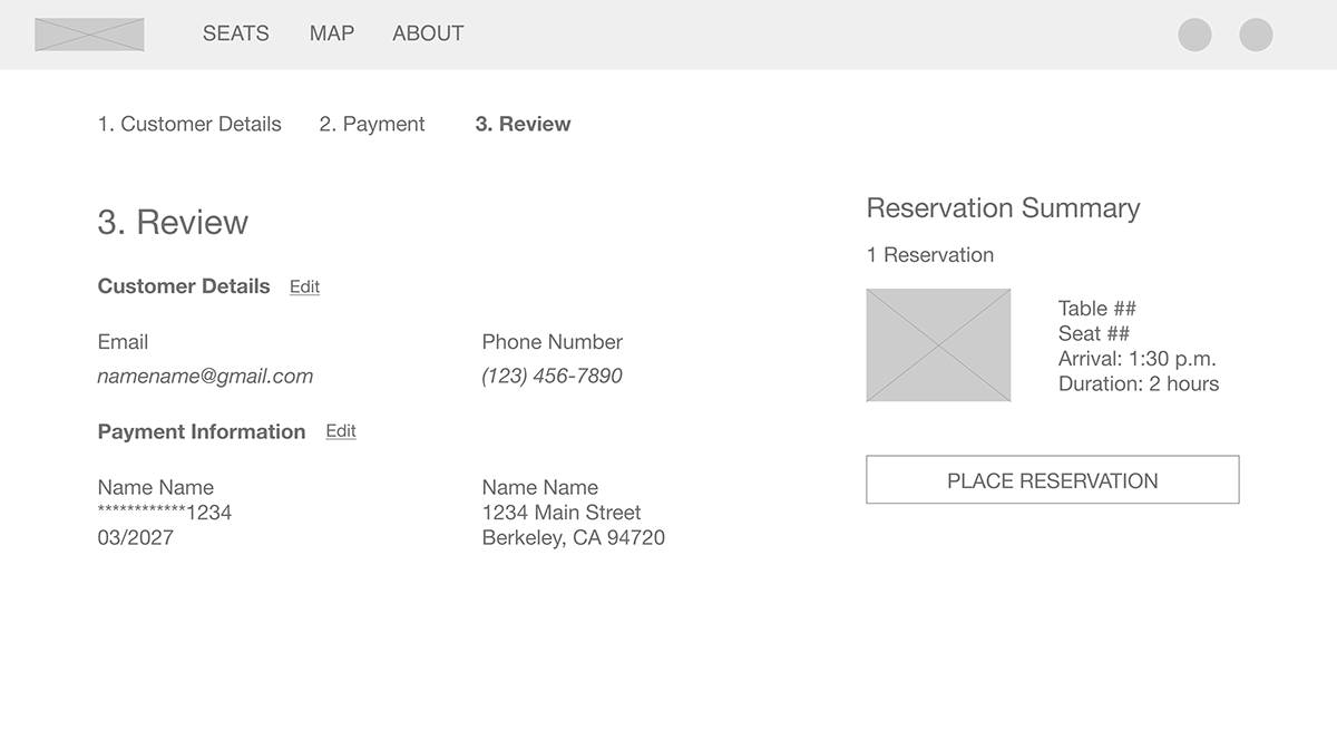
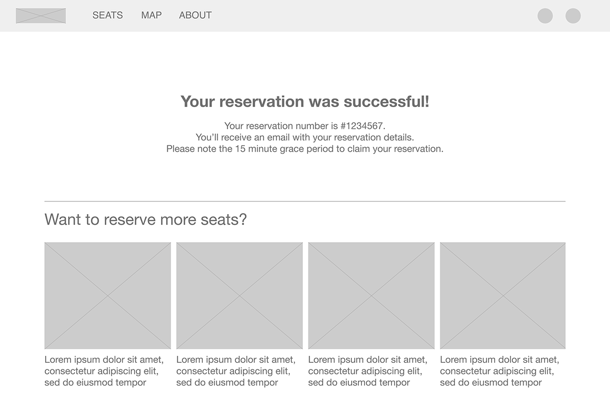
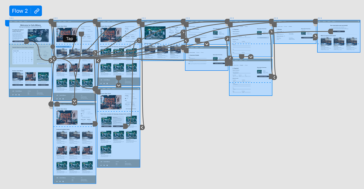
High-Fidelity Prototype
My high-fidelity prototype follows the same user flow as the low-fidelity prototype, and includes the design changes implemented from my usability study insights.
View the high-fidelity prototype here.
Accessibility Considerations
1. Keeping typographical hierarchy in mind, I used consistent headings across screens with different-sized text for clear visual ranking.
2. I included annotations next to interactive UI elements to indicate the traversal order for engineers in the development process, which helps users who rely on assistive technologies navigate through the website.
3. I provided screen reader access to the website for users with visual impairments by adding alt text to images and including multiple methods of navigation.
Takeaways and Next Steps
Impact
Our target users shared that the website was intuitive to navigate through and the intended user flow was simple to complete. They indicated that they would visit this website frequently in the future.
What I LearnedI learned that focusing on the pain points of the target user is the most important part of UX design, and that prioritizing their needs and empathizing with them helps me create better designs and solutions. User interviews and usability testing were the foundation for all of my design decisions.
Next Steps
1. Conduct follow-up usability testing on the new website to confirm whether initial pain points have been addressed.
2. Conduct further user research to investigate any additional potential unaddressed pain point.
3. Identify any remaining areas of need and ideate on new concepts and features.